CONTEXT
Internship
June 2023 - September 2023 (3 months)
Role
Product Design Intern
Team
Developer Platform
Reflection
Throughout my sophomore year of college, I was the sole designer at Pogo, a small 15-person company. Along with this, most of my other experiences had been personal projects. So going into the summer, I wanted to understand how a large company approaches design and product. I joined Slack as a Product Design Intern on their Developer Platform team, which is responsible for Workflow Builder, Slack's low-code automation platform.
Throughout the internship, my manager (shoutout Maria!) was incredibly supportive and gave me the freedom to choose my projects. Instead of pursuing one large project, I opted for several smaller ones, which allowed me to explore different aspects of design. Moreover, I expressed my interest in working across multiple product pillars, and Maria gladly facilitated this opportunity. Looking back on my summer at Slack, I can confidently say that it exceeded all of my expectations.
Here's a summary of what I did over the summer:
Week 1 - Figma Config!Weeks 2 & 3 - Suggested Steps in Workflow BuilderWeek 4 - SlackDay Hackathon, Reactjis Suggested using AIWeek 5 - Non-Premium Workflow Builder ExperienceWeek 6 - AI Automation StepsWeek 7 - Workflow Permissions to Accommodate Slack ConnectWeek 8 - Slack Kit, Android File EntitiesWeek 9 - Automated Slack Messages on MobileWeek 10 - Slack Sales Elevate Mobile New User ExperienceWeek 11 - Slack Demo VideoWeek 12 - Slack Kit, Audio ClipsWeek 1
Figma Config!
My first week kicked off with onboarding. However, in the middle of the week, I got to attend Config, Figma's annual design conference, which happened to be located just a few blocks away from Salesforce Tower! It was an pretty unique experience to be surrounded by thousands of designers, and I got a meet a ton of other Slack designers in person. One of the highlights was watching Ethan (Slack's SVP of Design) give a talk at Config about Slack’s product principles. Here are some fun photos from week 1:


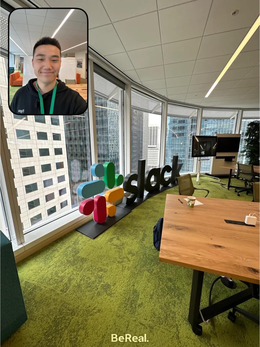
Photos from week 1 of my internship
Weeks 2-3
Suggested Steps in Workflow Builder
Going into week 2, I began working on my first project with the Developer Platform team!
You might have seen workflows inside of Slack before. Maybe you’ve filled out a form from a colleague before? Or maybe a support ticket request? Well, the Platform team is working on how users can build and set up that workflow. Using workflows is how you can automate tasks inside of Slack, and this automation platform is called Workflow Builder!
Now oftentimes, when you’re building a workflow, you’ll run into common errors when you’re missing certain required step(s). When this happens, you’ll receive a big red error message that looks something like this:
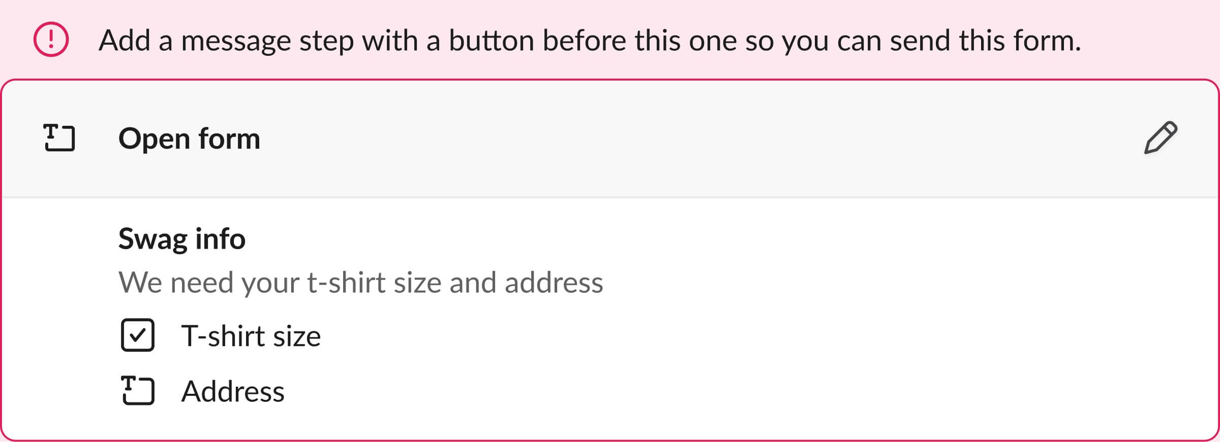
Example of a form collection step, without a message trigger beforehand, thus resulting in an error.
So to eliminate this error message, my goal was to design something that would provide suggestions instead of simply just stating the problem. This suggestion would appear somewhere in the workflow builder canvas.
I started by exploring how we could suggest steps based on the existing pattern from the step modal library on the right. Here are some early iterations of having suggestions appear in between existing steps:
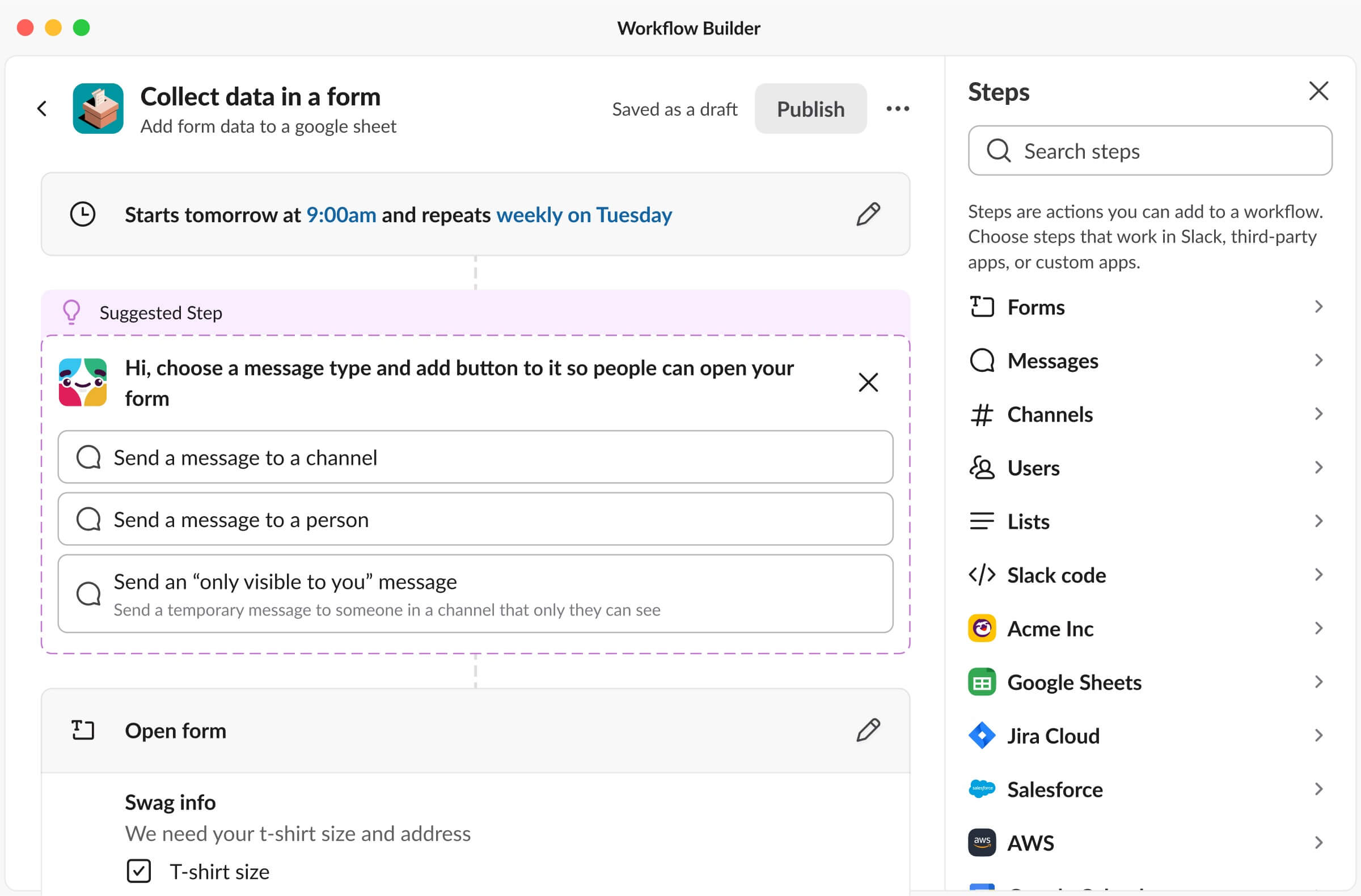
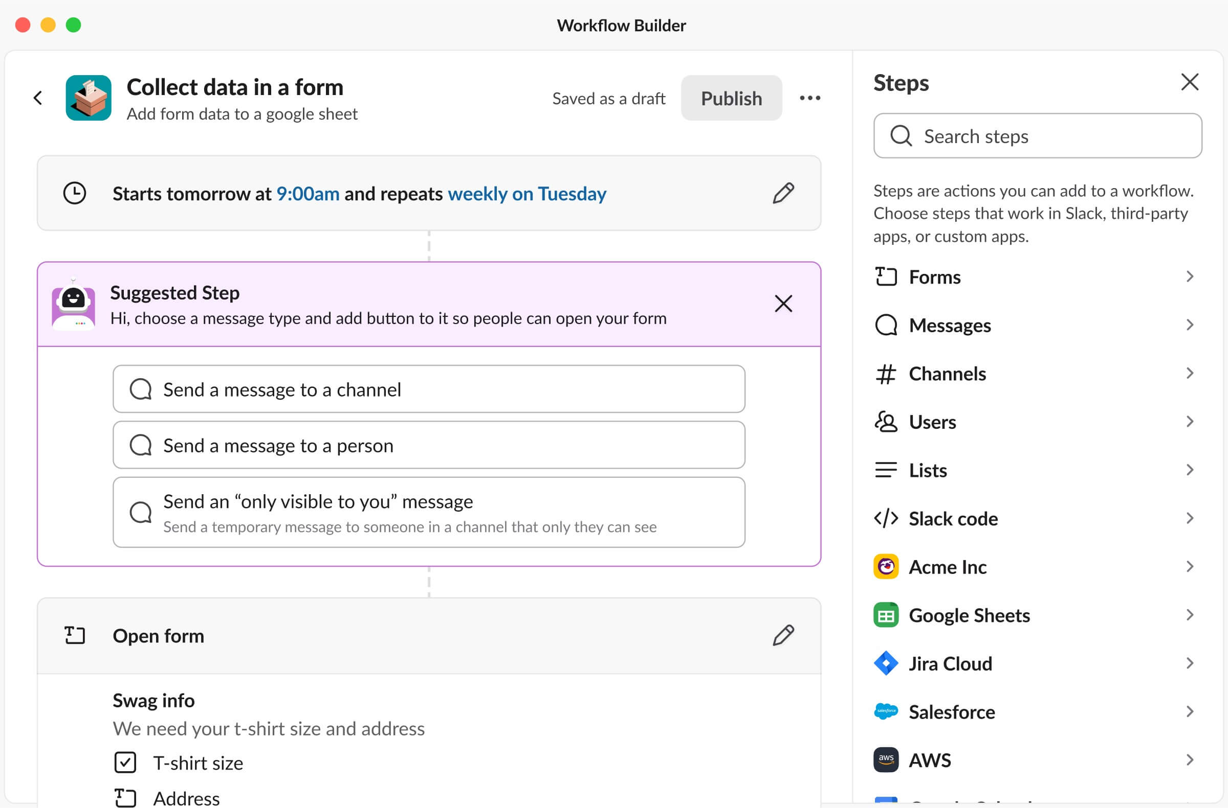
Early iterations of Suggested Steps
This concept worked, but an issue with this was that it took up too much vertical space on the workflow builder canvas. So I continued to iterate and explore designs where the buttons are horizontally stacked:
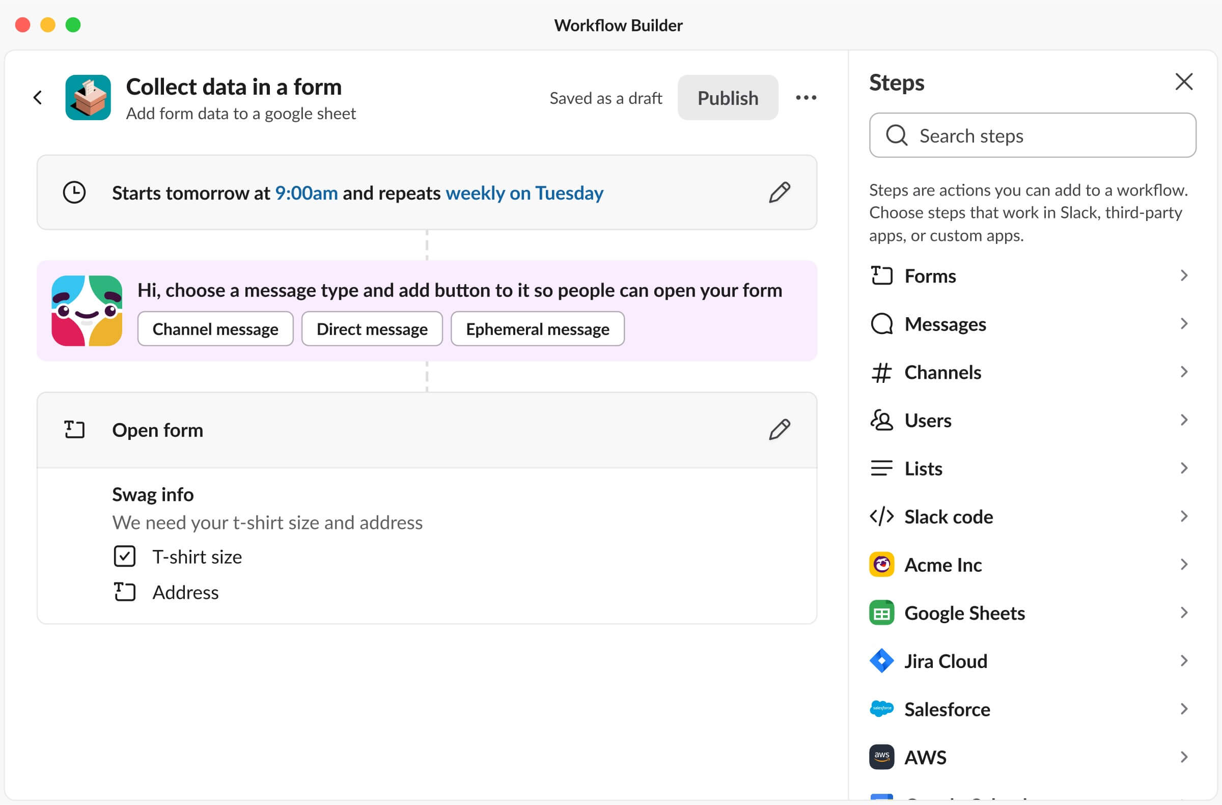
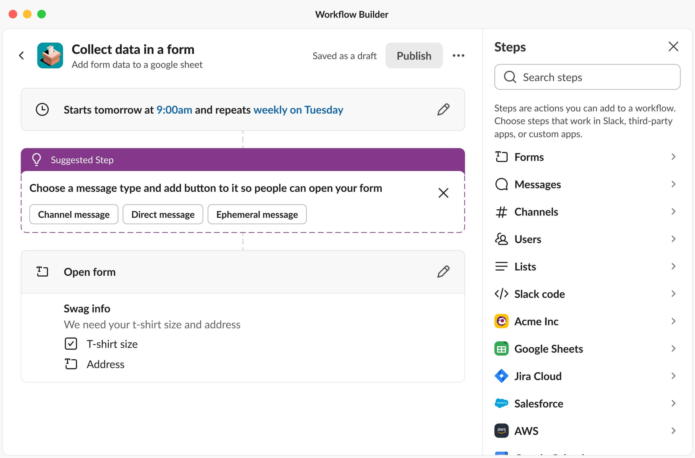
More iterations of Suggested Steps
The horizontal stacking made the designs much better by conserving more space. Building off of this, I thought Slackbot was a great way to introduce these suggestions. We could use Slackbot’s avatar and friendly tone to deliver these suggestions! In the end, to eliminate that error message and to create an actionable suggestion (be a great host!), here is the final design:
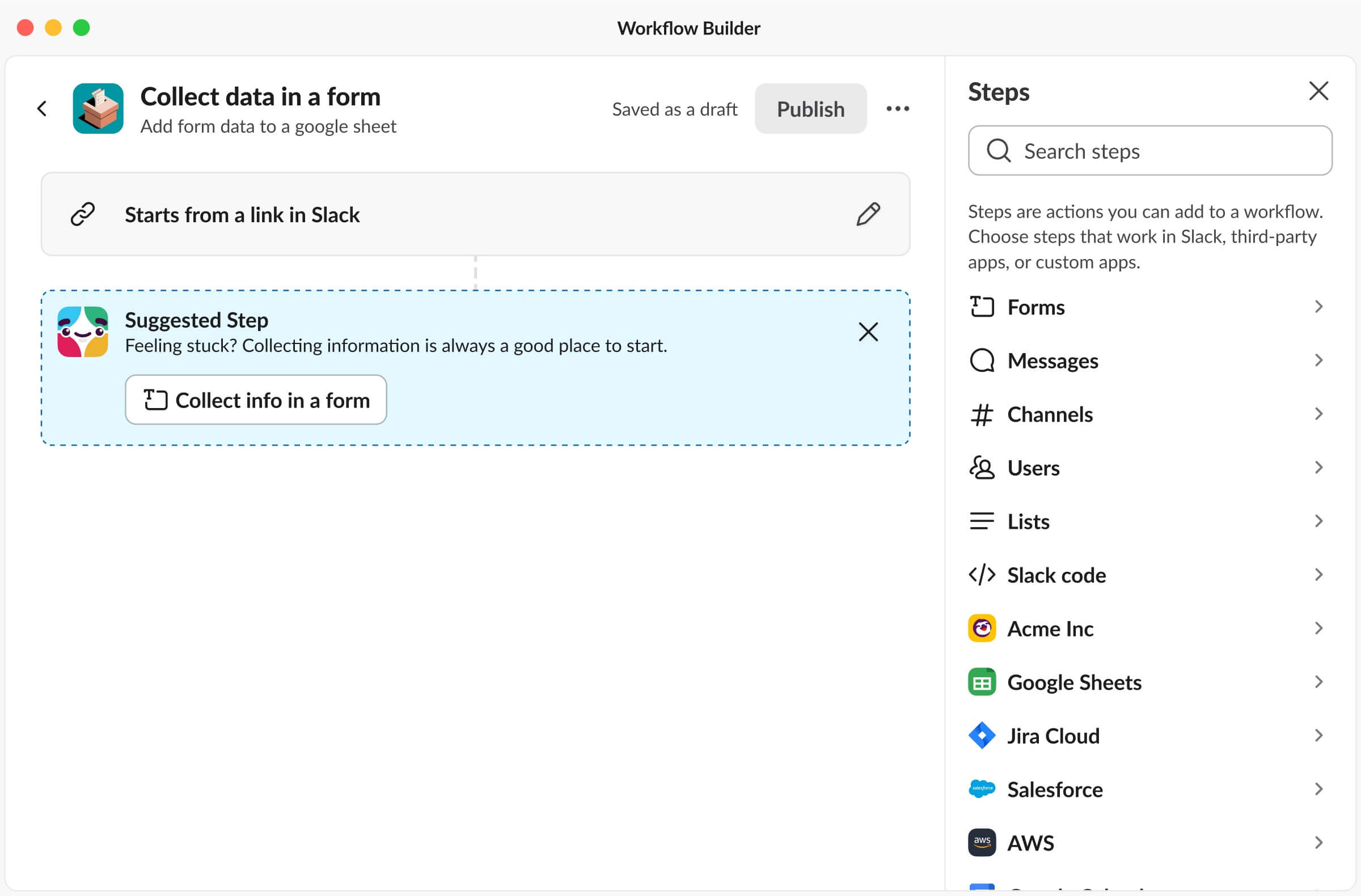
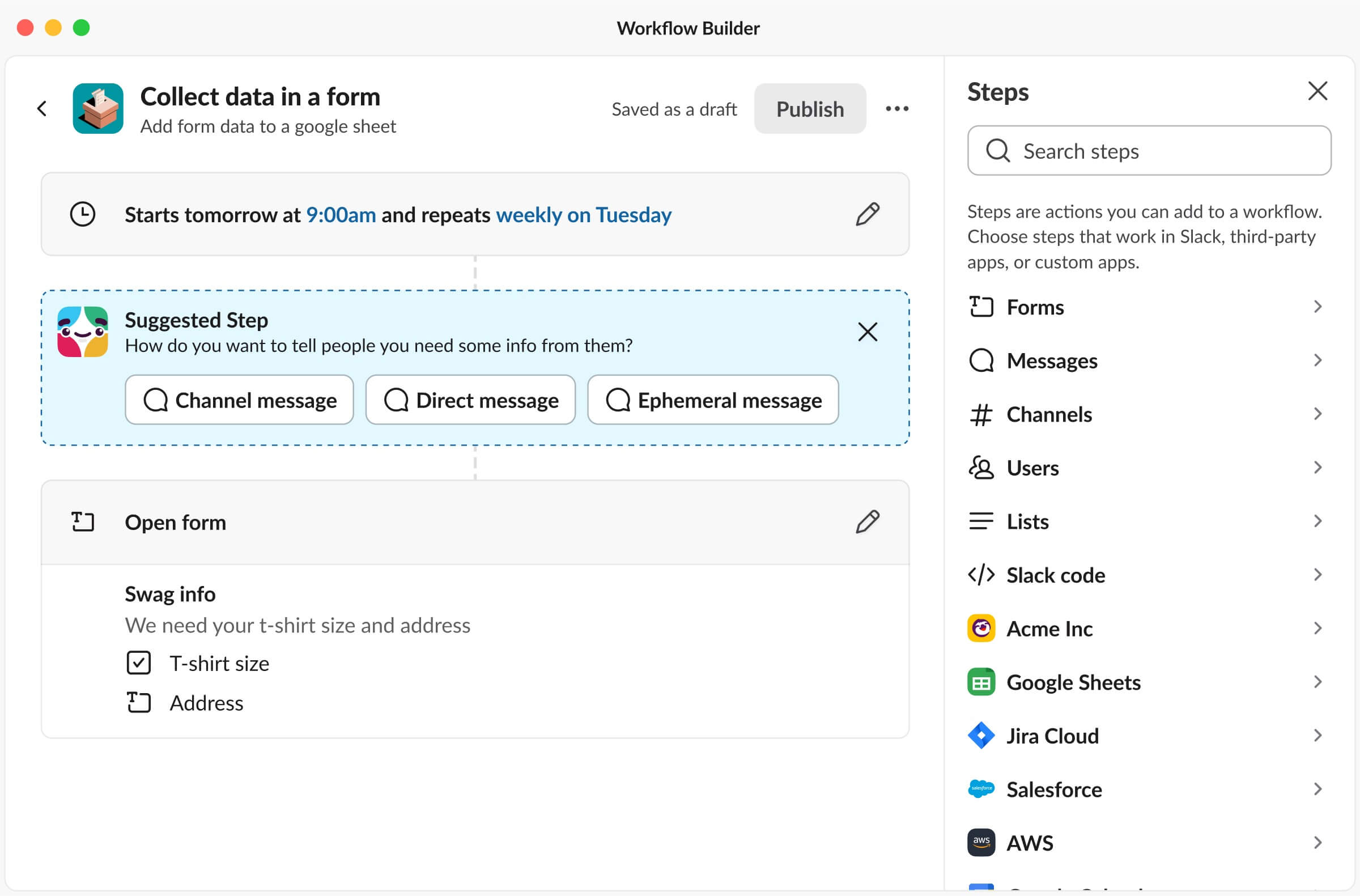
Suggested Step inside of Workflow Builder
In the end, since Workflow Builder is such a complex product, Suggested Steps makes a huge difference for our users! This was also a really interesting project because I worked with an engineering intern, Dustin, to build this out! This was his summer project and it was a unique experience getting to team up with another intern. Another cool aspect of this project was working with Annie, our content designer, to ensure the suggestions were clear to users while also coming across as friendly and sounding like Slackbot. Dustin wrapped up the summer by shipping it out to our internal Slack workspace, and will (hopefully) be available to GA soon.
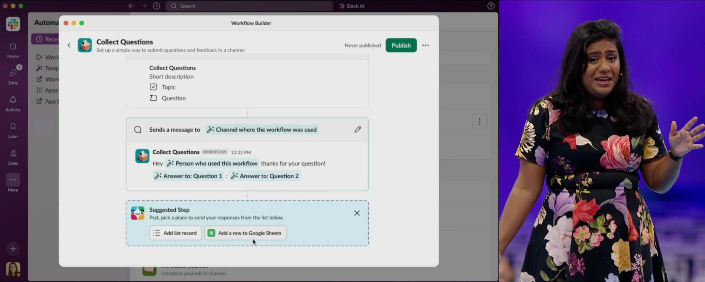
Rukmini Reddy (SVP of Engineering) presenting Slack automation during Slack keynote at Dreamforce 2023
P.S. after my internship ended, it was really cool seeing Rukmini Reddy (SVP of Engineering) present Slack automation (feat. Suggested Step) during the Slack keynote at Dreamforce 2023!
Week 4
SlackDay Hackathon, Reactjis Suggested using AI
While the design work for Suggested Steps wrapped up, we entered into week 4 of the internship with Slack’s 3-day internal hackathon called Slackday.
I teamed up with Slack engineering interns Yosif, Kevin, and Michael. When we began our brainstorming session for Slackday, we immediately gravitated towards designing something both enjoyable and useful. This led us to center our project around a Slack Product Principle, and the one we chose was “Don’t make me think”.
One area customers spend a lot of their time sending, reading, and reacting to messages. Take, for instance, a moment where a colleague shares their excitement about the new Spider-Verse movie. You instantly think of the ideal reaction—the spider-woo emoji, but you can’t find it and keep searching and searching.
Recognizing this challenge, we designed and built Slack reactjis suggested using AI. After scanning through a Slack message, we’re able to recommend multiple relevant reactjis. Now, that perfect emoji is simply a click away!
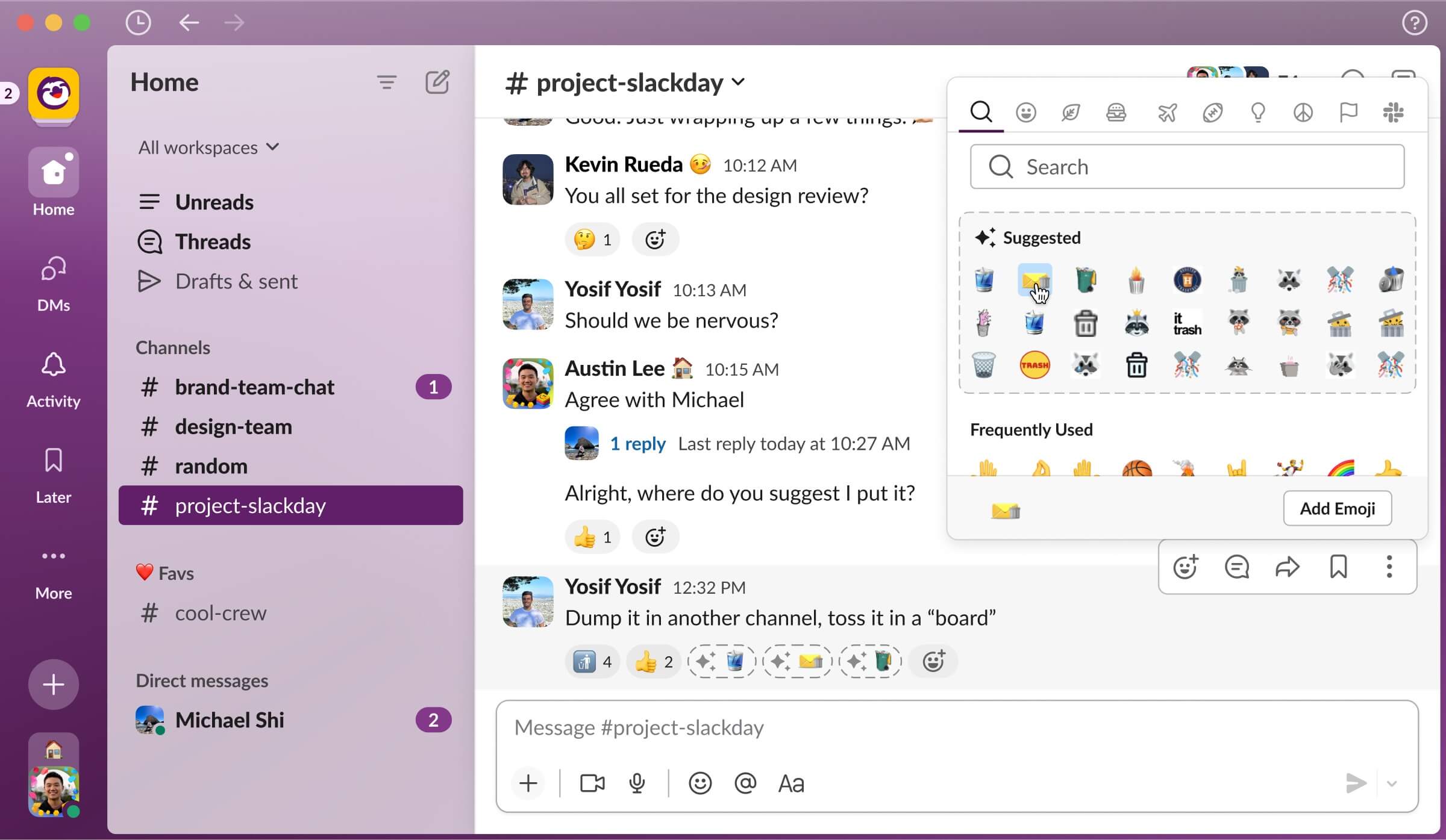
Mockup of AI recommended Slack reactjis
With the guiding principle of “don’t make me think”, I knew the suggested emojis needed to be immediately available and relevant to the content of the message. With this, I designed the suggested emoji using a dashed border and incorporated a sparkle icon to symbolize AI. Similarly to many generative AI tools, I presented three emojis suggestions to give users options. If this isn’t enough, they can open the emoji picker panel to reveal a dozen more suggestions.
A crucial design detail in this project was the emphasis on displaying these three suggestions directly on a message. Making them immediately visible truly embodies the “don’t make me think” principle. In contrast, only having suggestions in the emoji panel, introduces an extra unnecessary click for a user to discover suggestions.
While designing, I also considered the user experience of this feature. Suggesting emojis for every single message would be overwhelming, so I explored the best scenarios to suggest them. Some ideas included suggesting emojis on all unread messages, recent messages without reactions, or just on the single newest message. Part of my decision-making was influenced by the time and cost associated with the API call. Additionally, at a larger scale, it’d be financially unsustainable to suggest emojis on every single message. Ultimately, I wanted to give users the perception that the experience is seamless and “magical”, leading us to only on suggesting emojis for new messages.
Demo of AI recommended Slack reactjis
Above, you can see our friend, Tony Stark, who just sent a message saying “Hello Team! I will be going to PTO for two weeks. I'll be flying to Hawaii for a vacation!” Based on that message content, we have three recommended reactjis: PTO, airplane, and the Hawaii flag. What's even more impressive is that we've expanded this feature to recommend not just the native emojis, but also custom ones to keep your workspace fun!
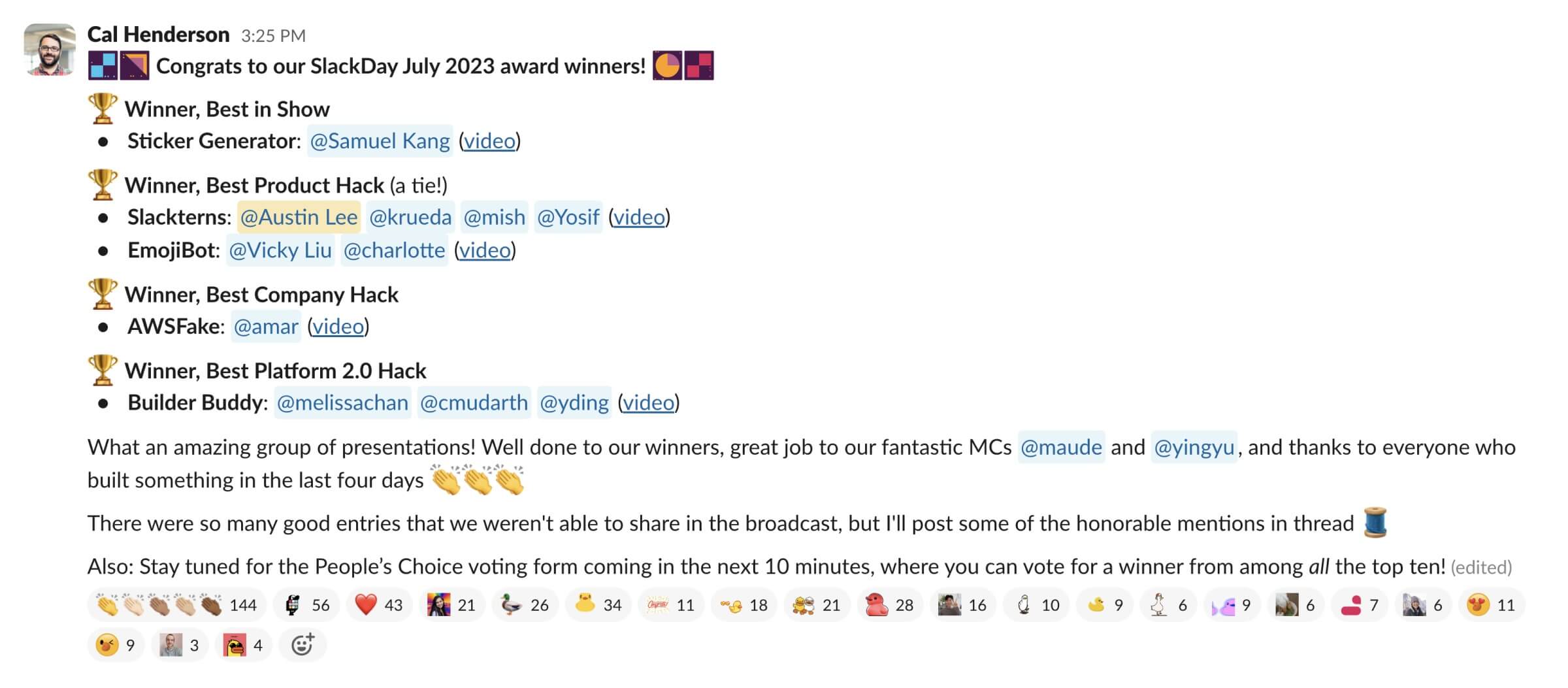
Message from Cal (CTO) announcing Slackday winners
In the end, we made it to the top 10, presented to Slack executives, and ultimately won ‘Best Product Hack’ and ‘People’s Choice Award’. Huge thank you for everyone’s support.

Message from Ross (Chief of Staff to the CTO) announcing People's Choice winner
Weeks 5
Non-Premium Workflow Builder Experience
After SlackDay, I returned to the Developer Platform team for a new project. For context, premium workflows are workflows that use any custom steps or more than two third-party steps, such as Google Sheets, GitHub, or Asana. When a workflow becomes premium, admins will be charged each time someone runs that workflow. But despite our pricing accommodations and free limit offerings, a lot of Slack's big enterprise customers are uncomfortable with turning on Premium Workflows for everyone.
Recognizing their concerns, we chose to empower admins by offering them the flexibility to designate who can build premium workflows. With this, Dan, a designer from the enterprise team began designing the admin experience while I designed the Workflow Builder experience for non-premium builders.
While working on this, the primary UX question that posed a conflict for us was whether we should prevent users from using additional third-party steps after they've used one or allow them to continue exploring.
Historically, if a feature in Slack wasn't available for a particular user group, our solution was to hide it, thereby reducing potential confusion. This was especially the case for in settings pages. Adopting the same approach here would mean disabling all custom and third-party steps as soon as a third-party step is added. This would work well and communicate the limits clearly to builders.

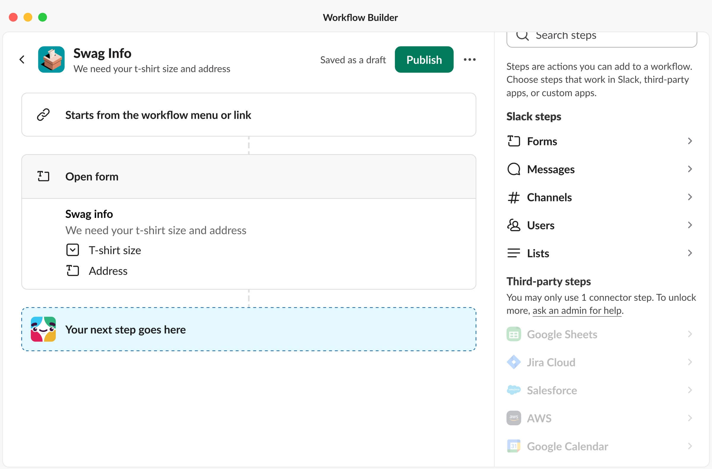
Disabling third-party steps for non-premium builders
Alternatively, we could allow users to continue exploring the full capabilities and value of Workflow Builder, but this would come at the expense of their ability to publish. After presenting both options to the team, we decided to move forward with allowing users to explore the full capabilities of Workflow Builder. The rationale was that we didn’t want users to miss the true value of the Workflow Builder by restricting their access. This avenue also provides builders an opening to test and craft automations before they ask for elevated permissions. On top of that, users have the option to ask an admin to release the workflow in their place.
After further discussions and iterations, we have arrived at the final design for non-premium builders. This design will begin shipping to GA in September 2023.
Let's begin by following the suggested steps to add a third-party integration with Google Sheets to store our form data:
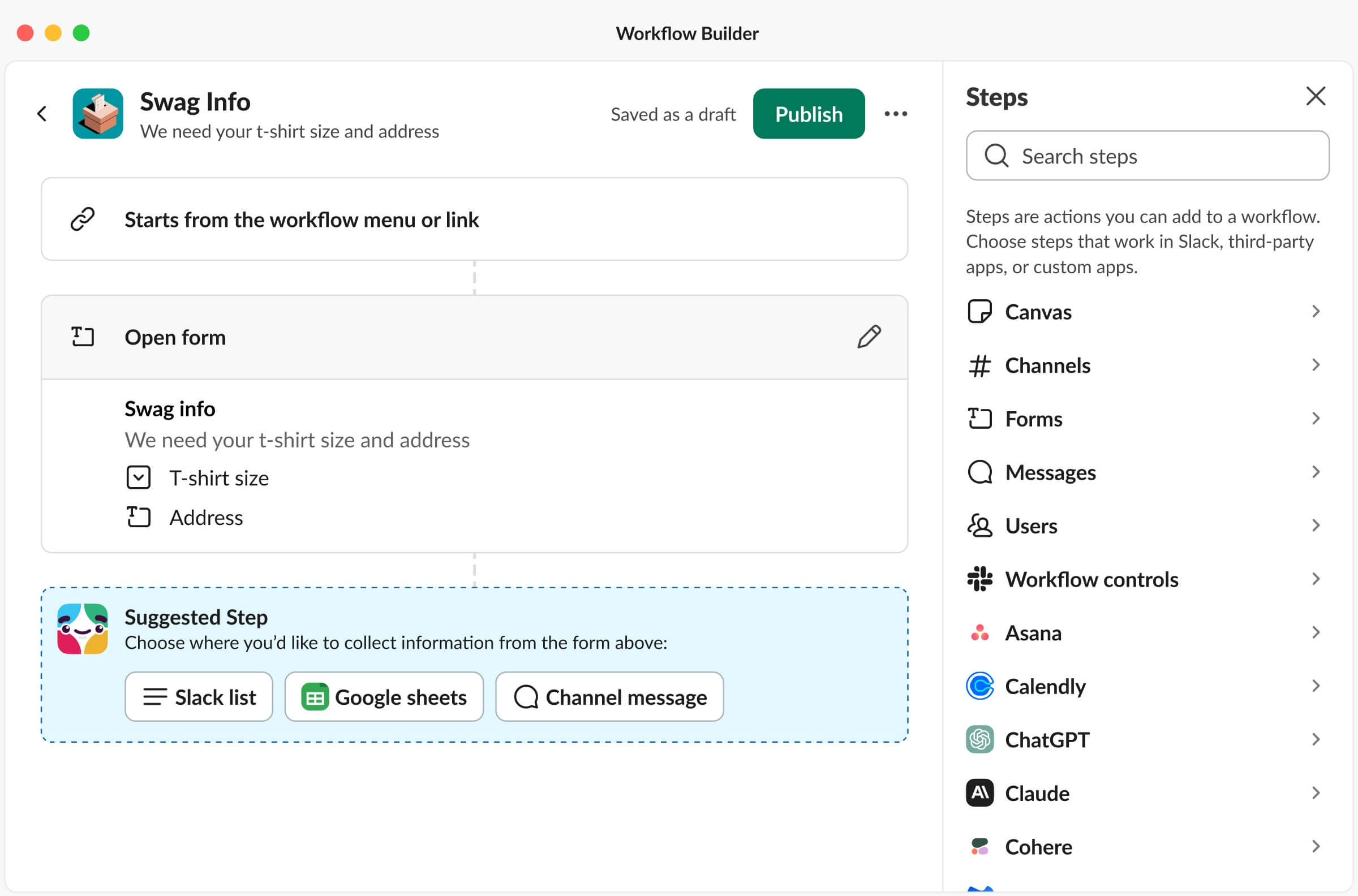
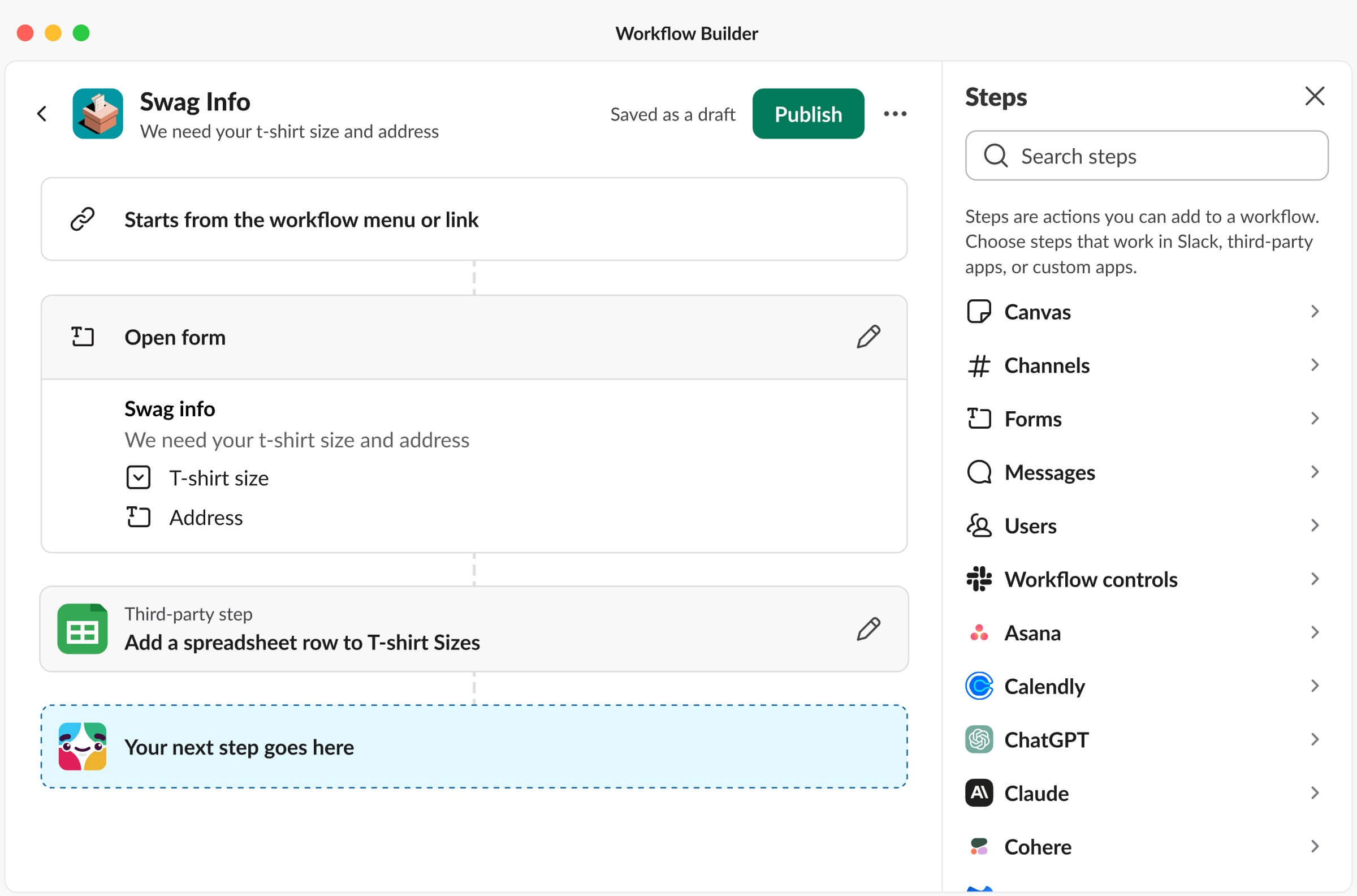
Using Suggested Step to add a Google Sheets third-party step.
Now that we've added one third-party step, attempting to add another will trigger a warning in our step modal library. But let’s proceed anyways. Upon opening a new step, another warning modal will appear, prompting us to contact our admin for assistance:


Opening a ChatGPT third-party step
Finally, despite the warning, we can still configure and save this ChatGPT step. Once this second third-party step is added, warnings appear over each third-party step, and the publish button becomes disabled:
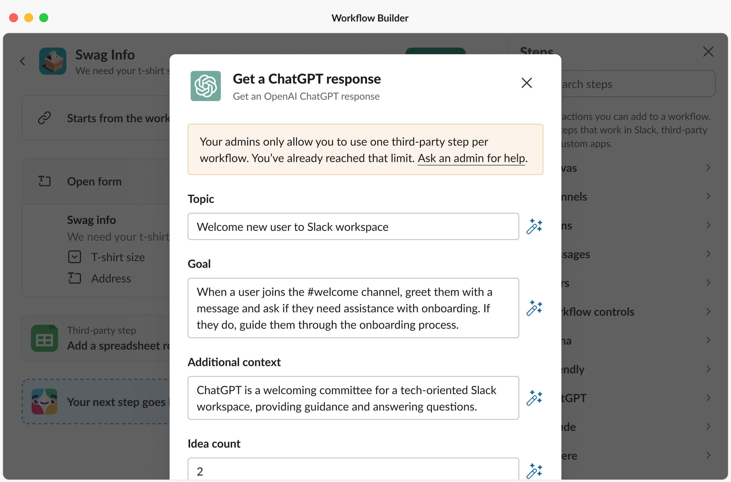
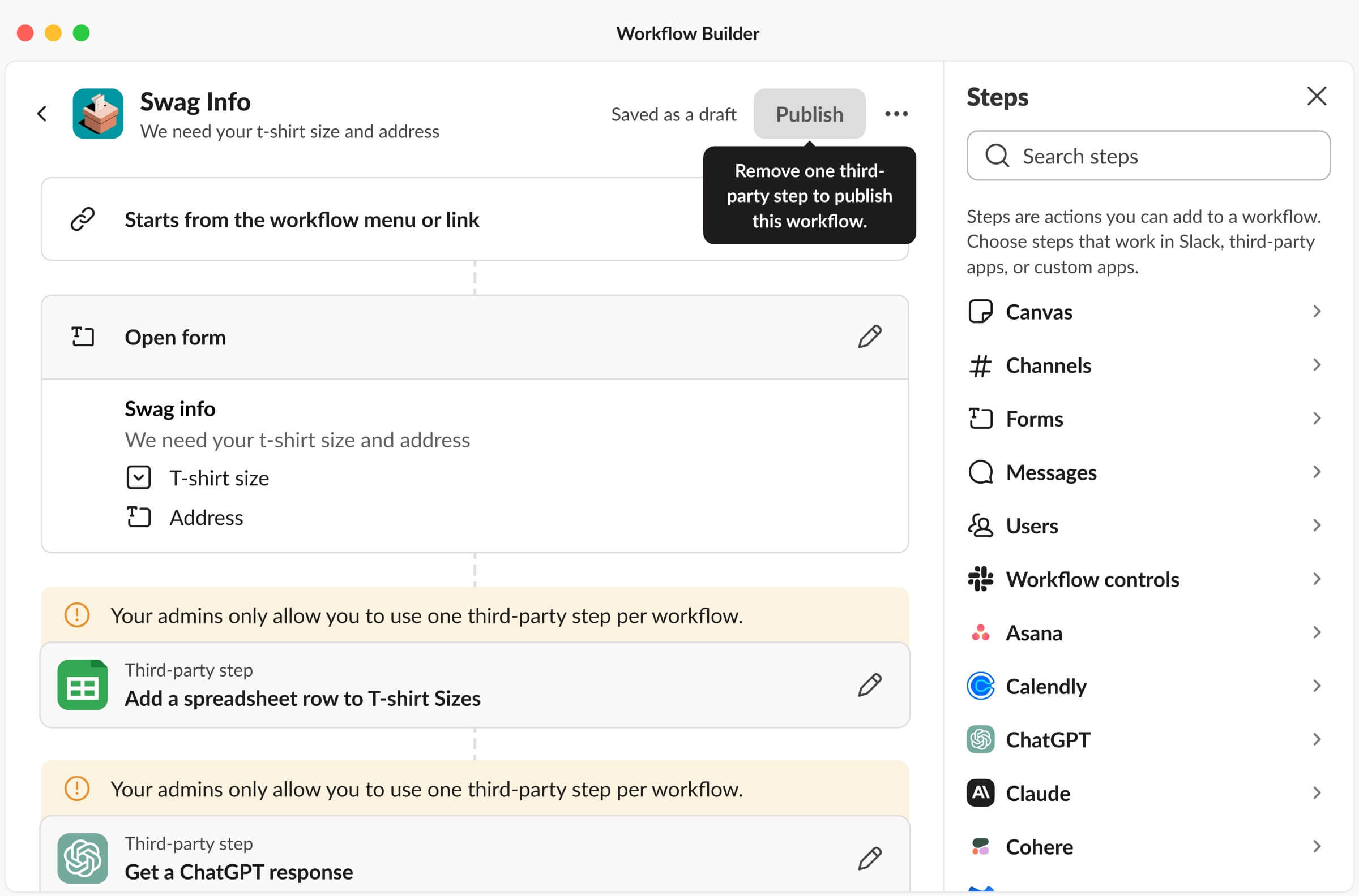
Configuring and saving the ChatGPT third-party step.
Week 6
AI Automation Steps
Midway through my internship, I collaborated with Cory, another designer from the Platform team, to explore what AI automation steps would look like in Workflow Builder. Unfortunately, I can’t share details about this project (but maybe I’ll come back and add it in the future once it becomes public).
Week 7
Workflow Permissions to Accommodate Slack Connect
Alongside the AI explorations, I also started designing an updated workflow permissions page to accommodate Slack Connect, a feature that allows companies to collaborate with external organizations directly in Slack.
When setting workflow permissions, builders often assume that selecting their own workspace grants access to everyone externally connected to their organization. However, this assumption is incorrect. This results in members from external organizations encountering permission issues, leaving them unable to run the workflow. Moreover, builders cannot add multiple external organizations. For instance, it's not possible to build a workflow for employees from both Slack and Salesforce.
In the old design for customizing workflow permissions, there were only two choices regarding who could use the workflow: either everyone internal to your organization or specific named individuals, channels, or workspaces. There was no way to include external organizations other than individually adding every single connected channel. Here is the old workflow permissions page:
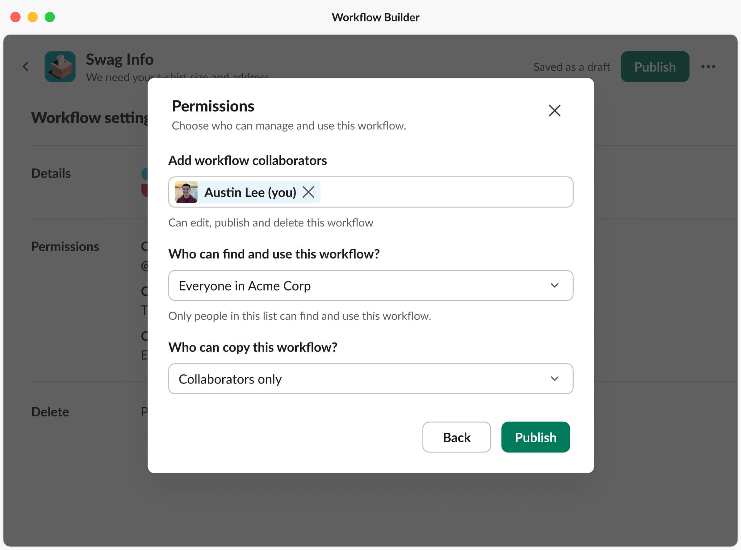
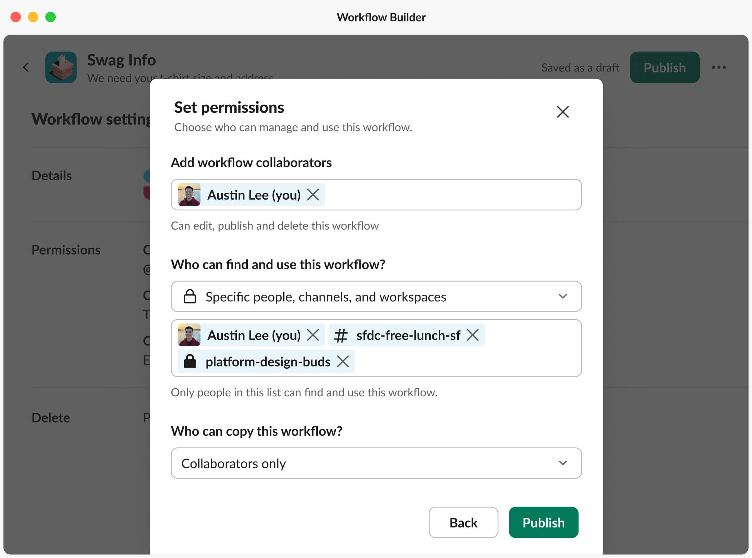
Old workflow permissions page
As I started designing a way to introduce a new way to add externally connected organizations, I looked into adopting the Slack Connect pattern used in channels to ensure consistency:
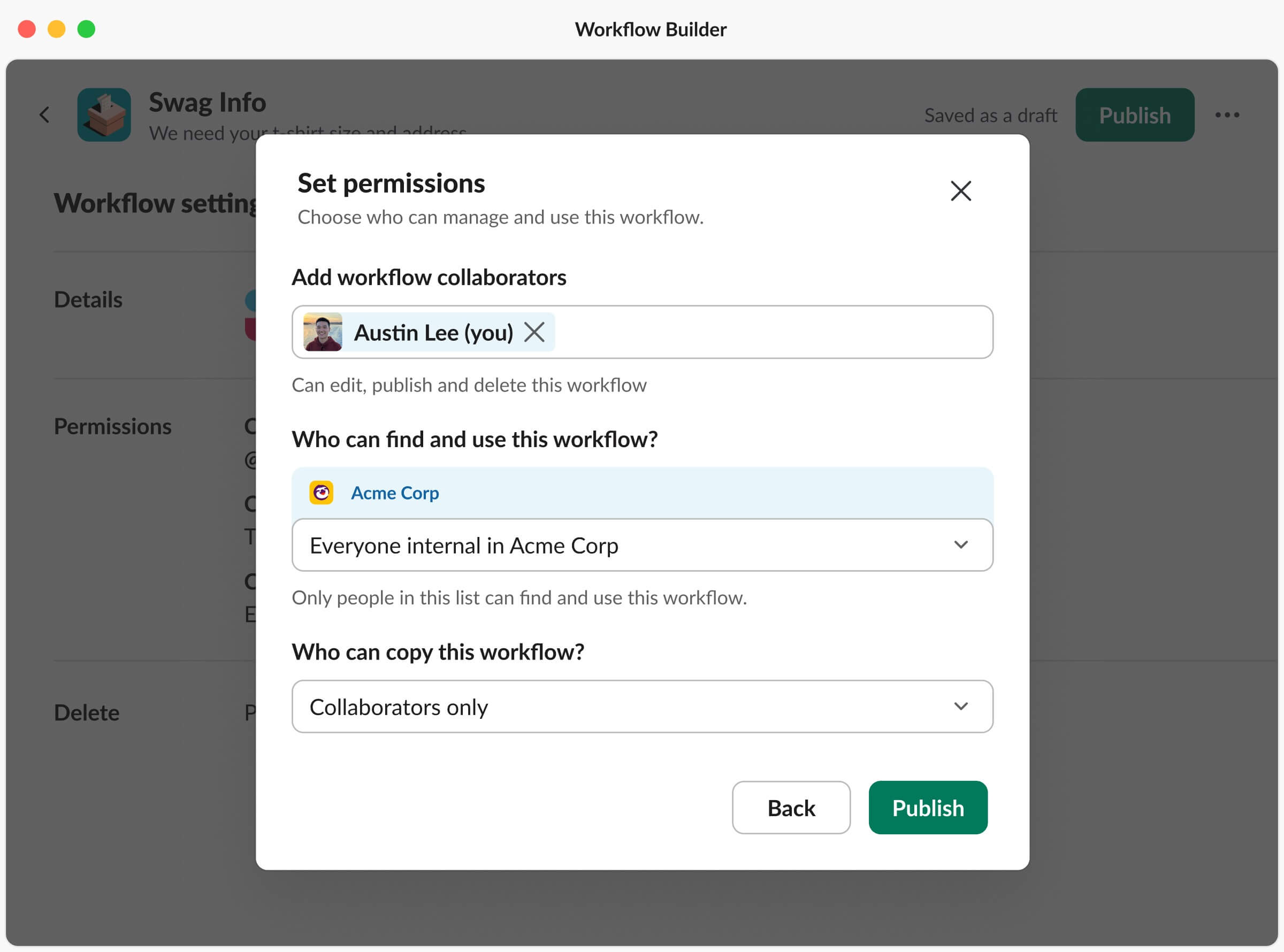
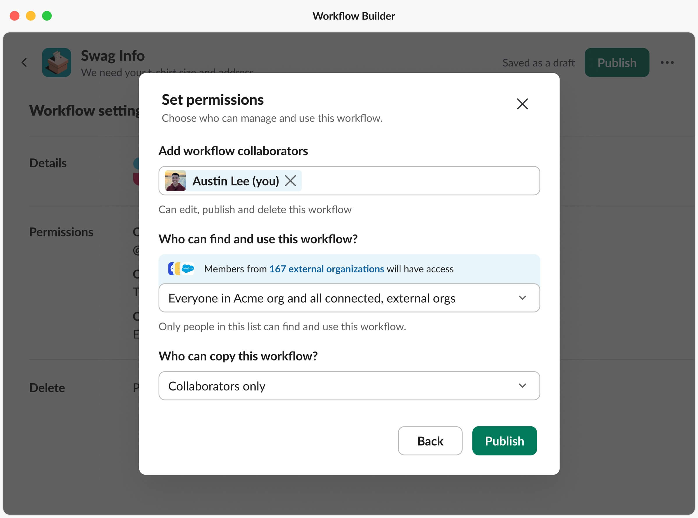
Early iterations of workflow permissions to accommodate connected external orgs
However, following design critiques from my team, this design pattern proved redundant for dropdown options when no external organizations were listed, like when selecting just your internal org. With my team's feedback and several further iterations, my final design featured a checkbox under the section “Who can find and use this workflow?”. When checked, it would reveal an input field for builders to list connected external organizations:

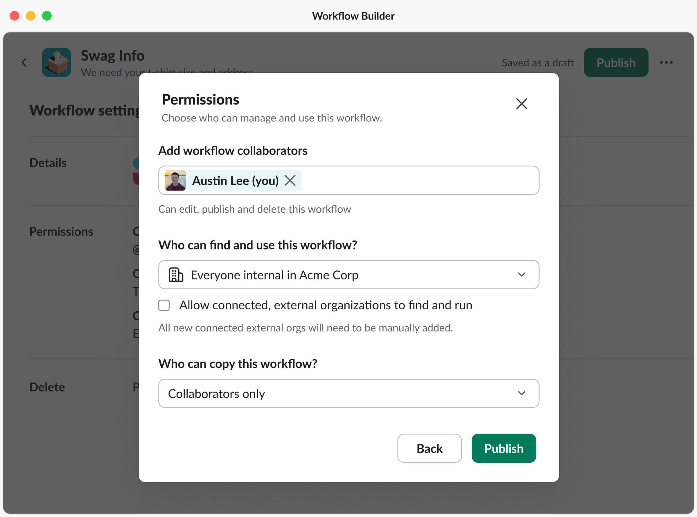
New workflow permissions page to accommodate connected external orgs
This new design allows builders to specify which connected organizations can access the workflow. By default, the checkbox is enabled, and all connected organizations are pre-populated. A significant consideration was the scalability of this design. With some insights from Slack’s data science team, we learned the median number of connected organizations is two and the average is nine (the max is Salesforce with 25,700 connected organizations). We believed this design would effectively address the concerns of nearly all organizations, with edge cases being a rare exception. Overall, given this project’s status as being a blocker, this new design will (hopefully) positively impact a lot of builders. This is scheduled to roll out one month after my internship ends.
Week 8
Slack Kit, Android File Entities
Going into week 8, my wonderful manager, Maria, gave me the opportunity to explore work beyond the Developer Platform team. One area I've had a growing interest in is Design Systems and how we build internal tools for other designers. I began working with Matt, who’s in charge of our design system, Slack Kit.
I chose to help with refactoring the Android File Entity components. The old components were missing various states, and were constructed in a way that made it difficult to switch between variants. Here’s what the components looked like before:
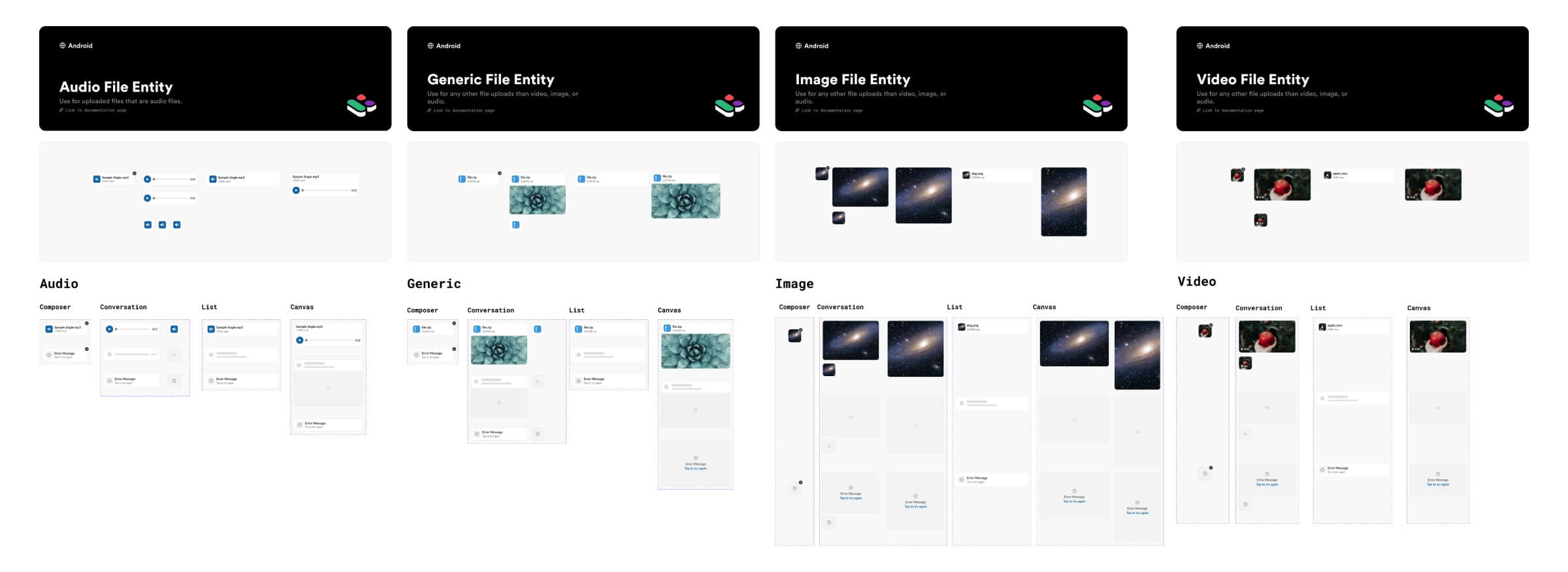
Old components for Android File Entities
I deliberately chose to work on this project within Slack Kit because it would provide a solid introduction to our methods of structuring, naming, and testing components. Matt was always there to answer my questions and provide incredibly helpful insights. Additionally, one particularly helpful aspect of this project was the ability to reference and learn from the updated iOS File Entity components. In the end, I updated the Android components to be consistent with iOS, and also reduced the quantity of component sets! Here are the new components:
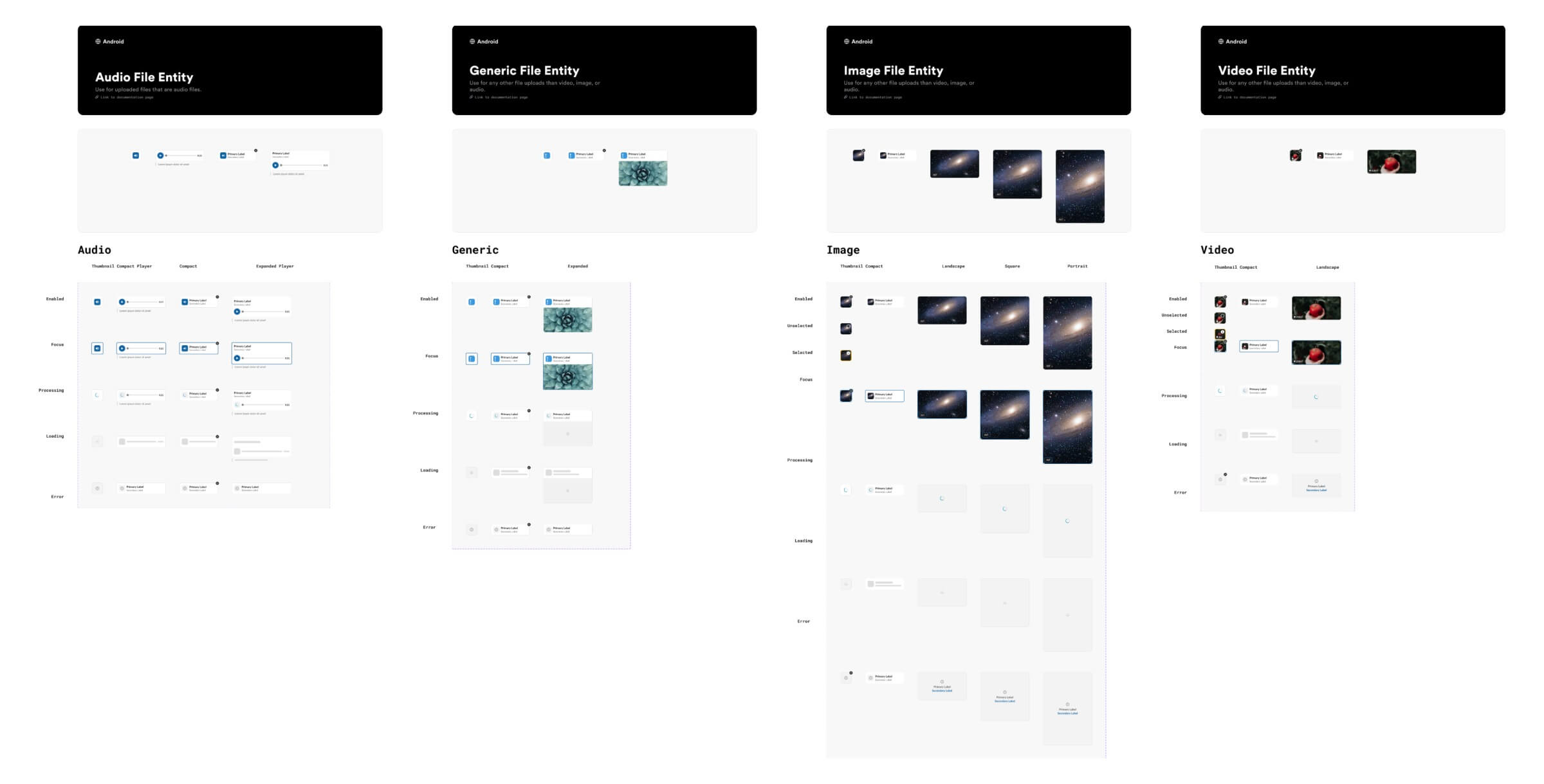
New components for Android File Entities
Weeks 9
Automated Slack Messages on Mobile
In the early part of week 9, I wrapped up the File Entity project and then moved on to working with mobile designs. We noticed an issue where the line wrapping breaks on mobile devices when a workflow has a long name. Here's an example of what that looks like:

Old workflow automation message in channel
I explored various design alternatives for automated messages from workflows. One idea was to move the "WORKFLOW" pill to its own separate line. I also considered using an icon in place of text, given that the text occupies a significant amount of space. Here are some early iterations:
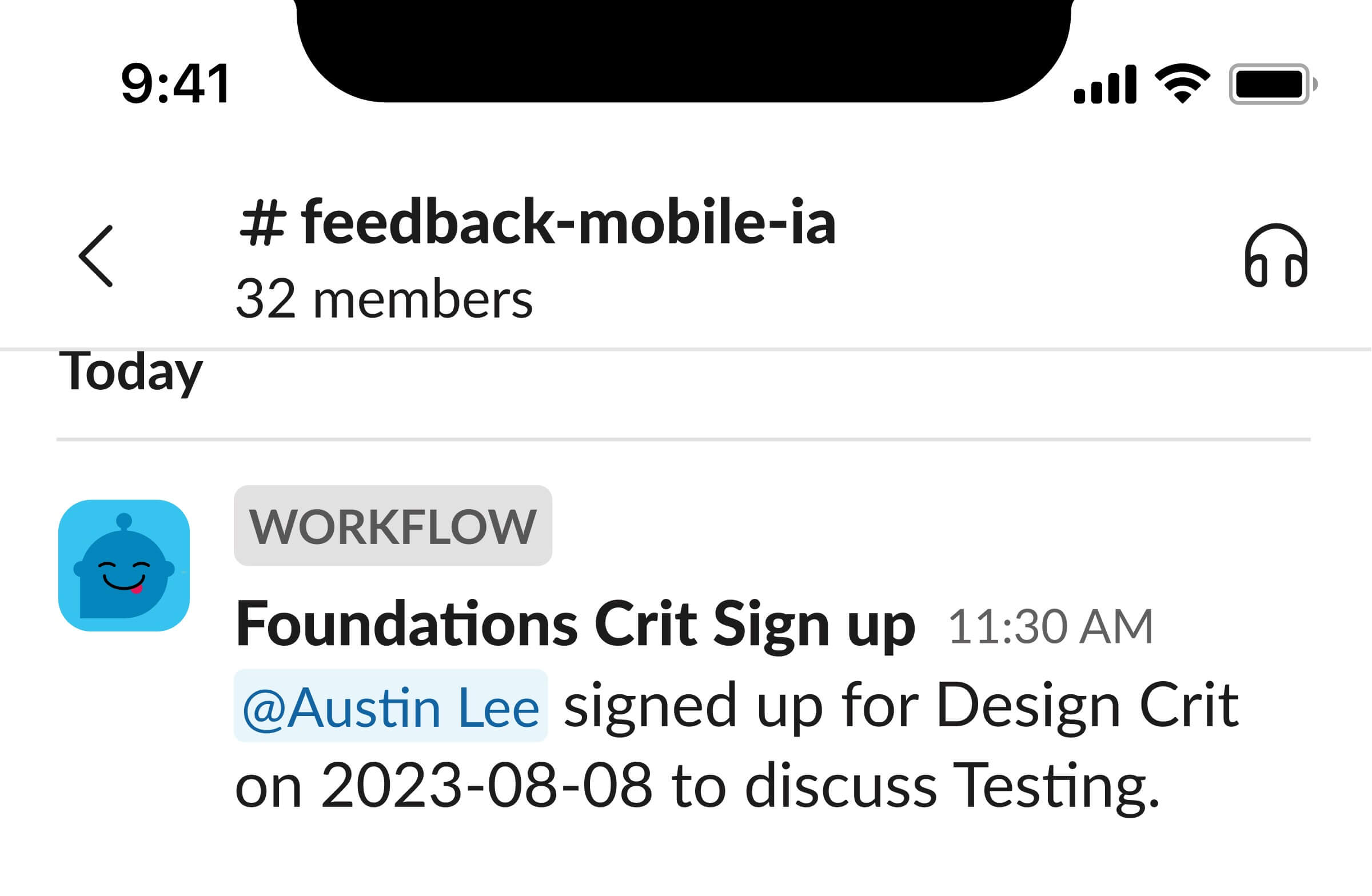
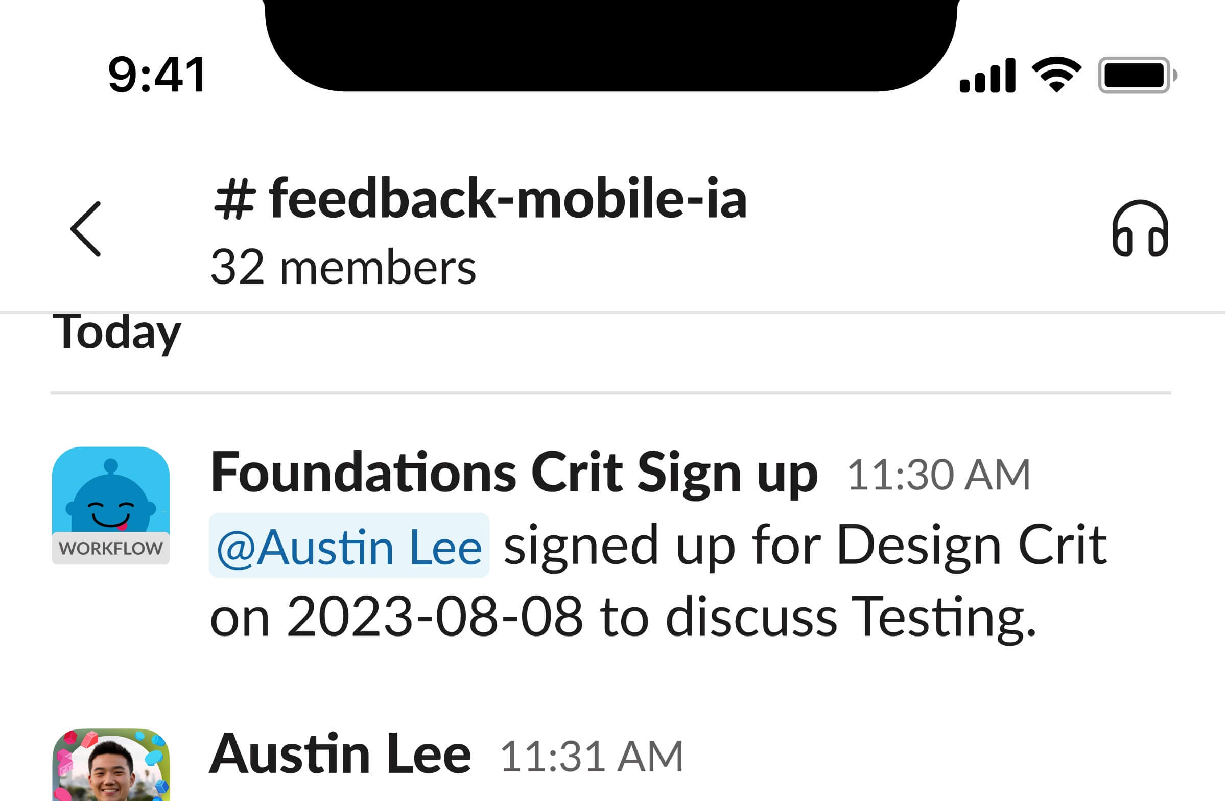
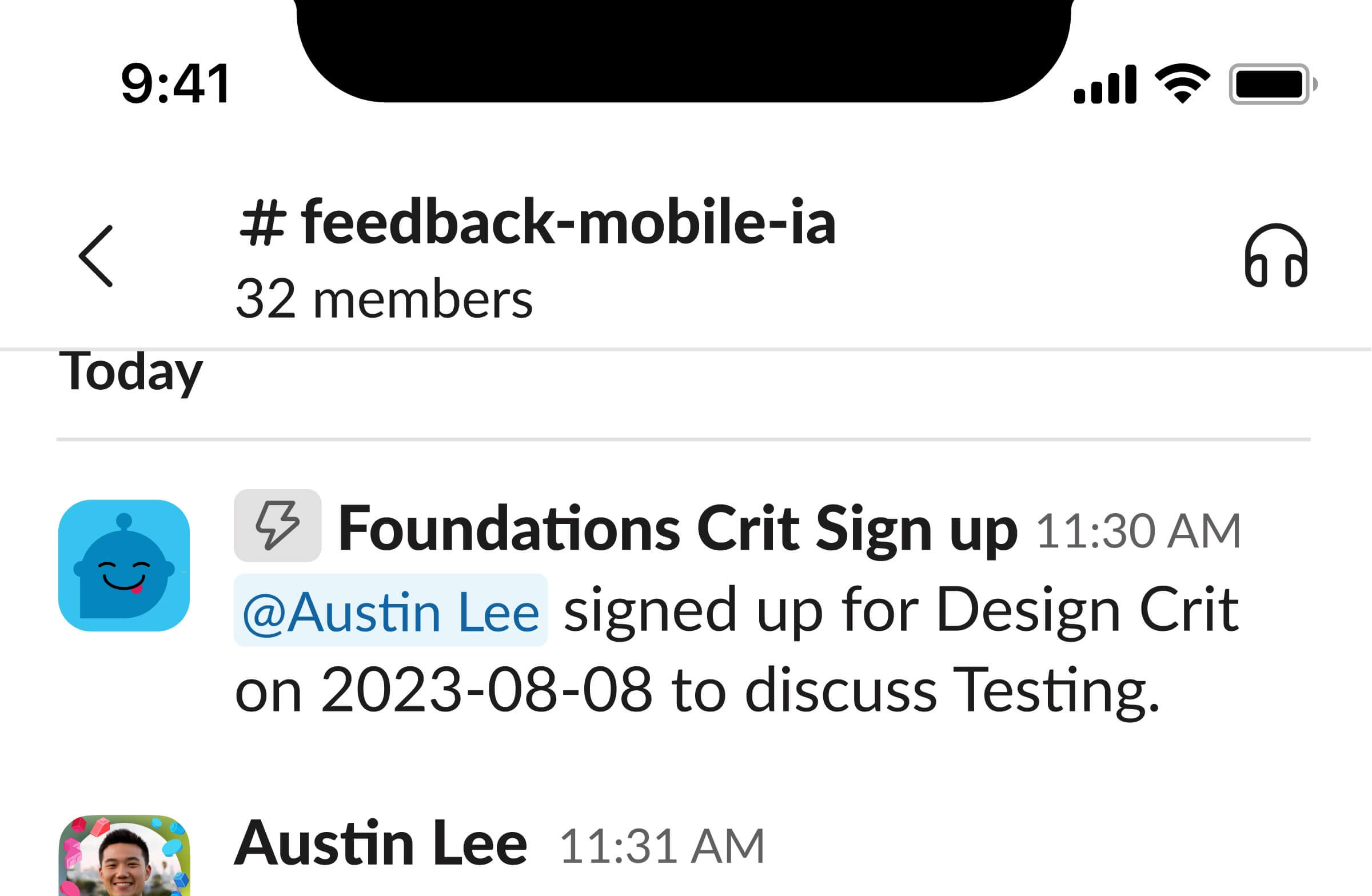
Early iterations of automated messages on mobile
After receiving feedback from my intern mentor, Pratik, he suggested exploring existing patterns. We discovered that similar patterns are frequently used in other social media apps and in Slack’s lists, a new tool set to pilot in winter 2023. This prompted us to try using components and colors from Slack lists:

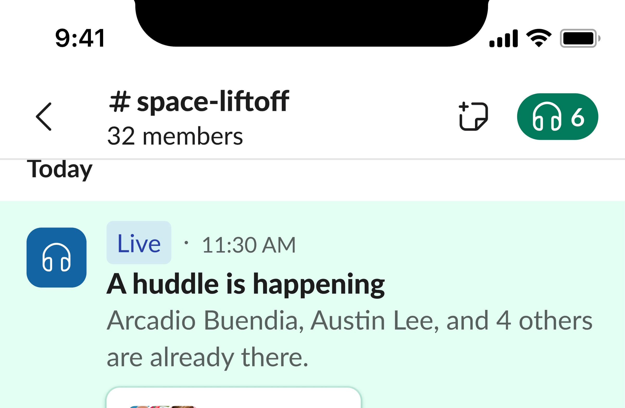
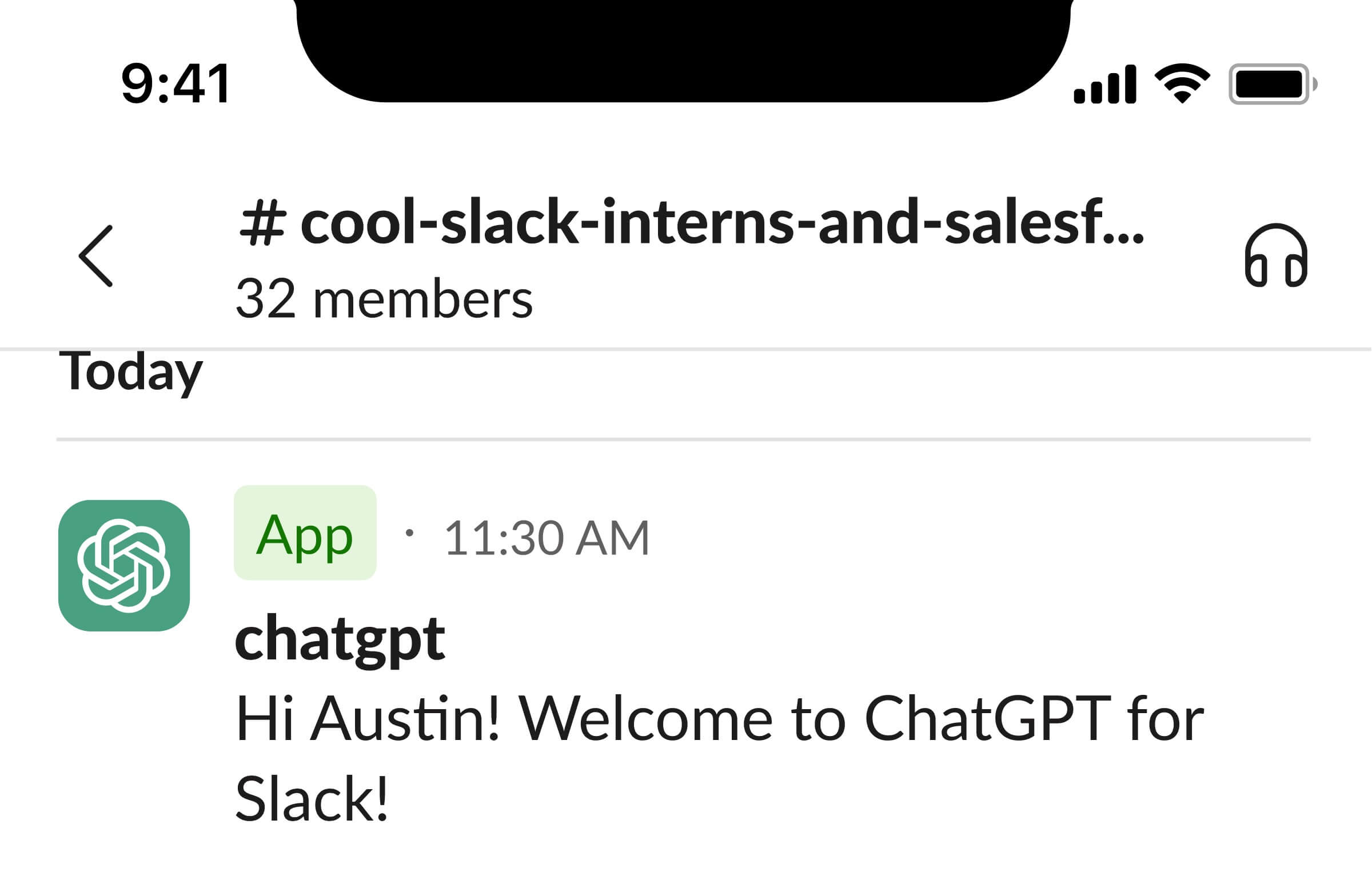
More iterations of automated messages on mobile
Ultimately, based on further feedback from the team, we determined that designs without the pill were the most effective. They consume less vertical space and ensure greater consistency across different scenarios. Furthermore, placing an icon over the image clearly indicates when a message is not coming from a human. Here's how the pill looks when replaced with an icon over the avatar. This design also scales effectively for both Huddles and Apps:
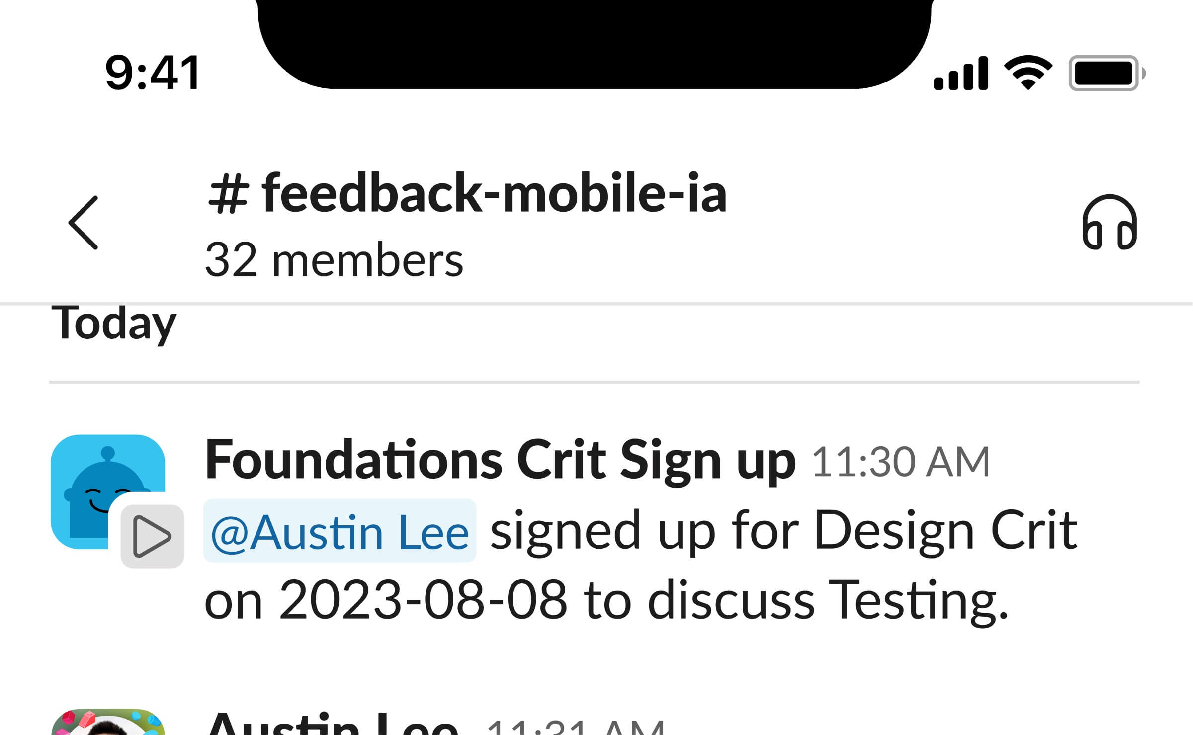
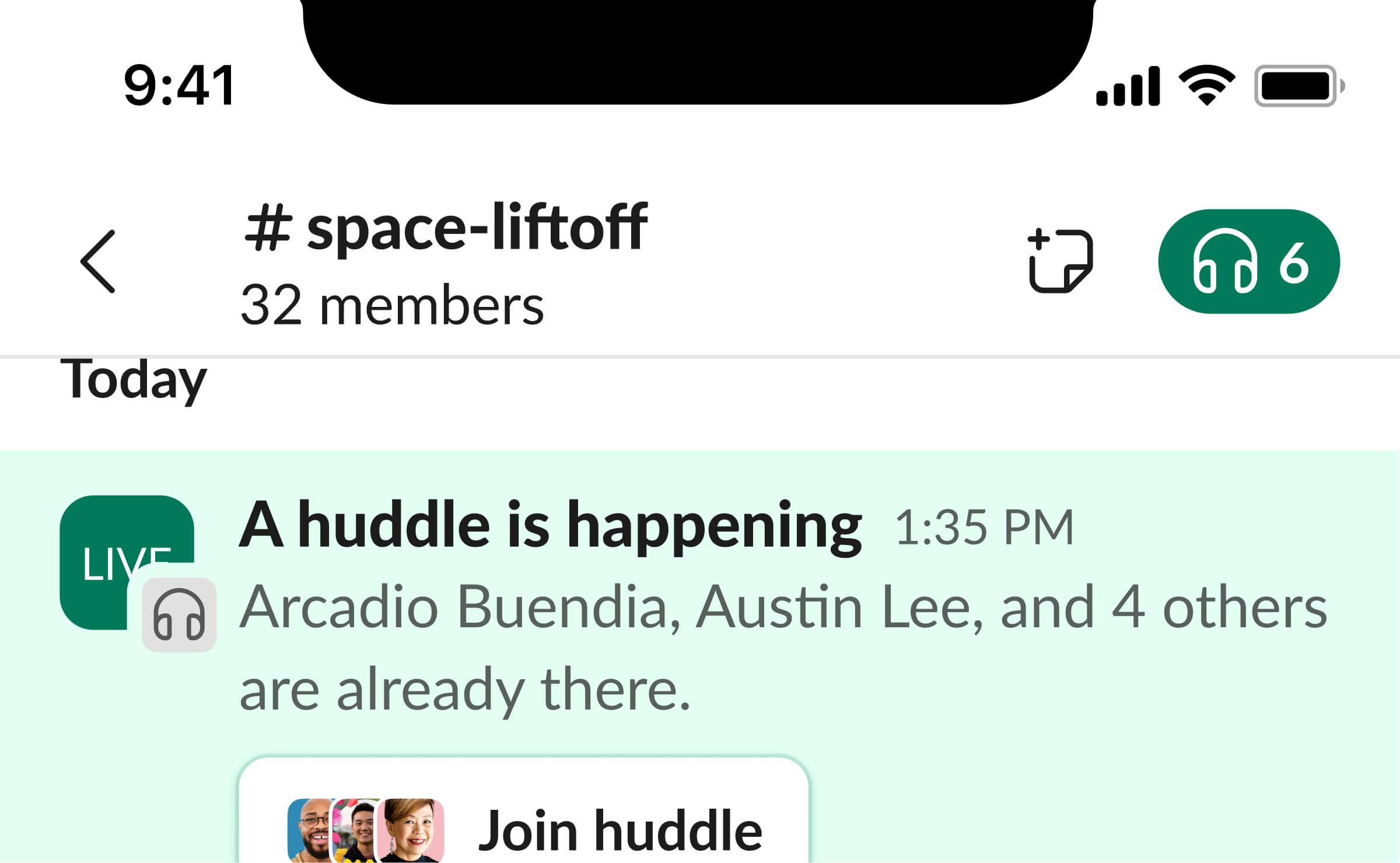
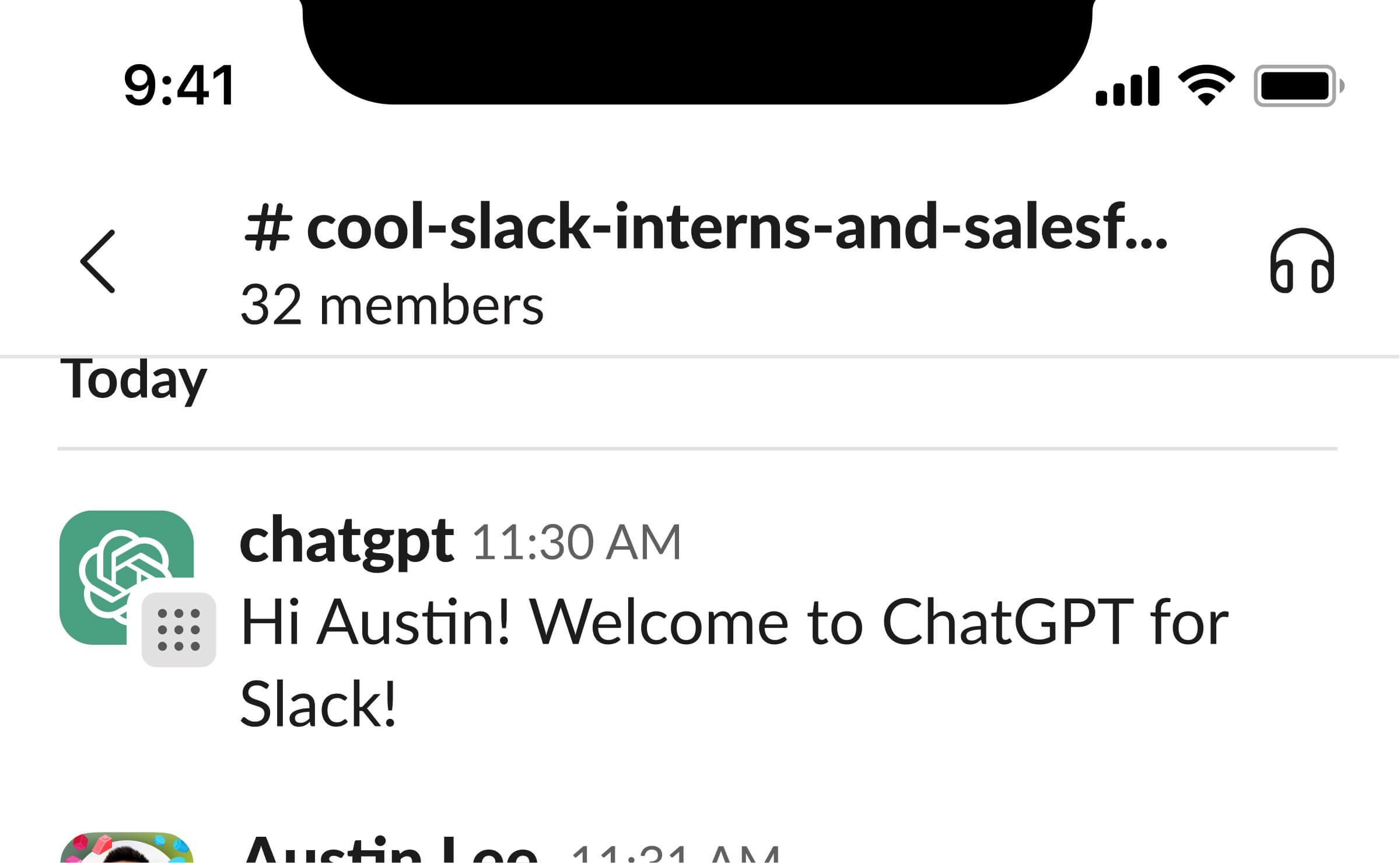
New automated messages on mobile
Week 10
Slack Sales Elevate Mobile New User Experience
Continuing with my interest in mobile designs, I began working with Justin, a designer from the Line of Business team. His team is responsible for Slack's new platform for salespeople, Sales Elevate, which integrates Salesforce Sales Cloud directly into Slack.
One of the features of Sales Elevate enables salespeople to view and update Salesforce opportunities directly within Slack. We learned that while sellers love this ability to update their opportunities via their mobile Slack app, many are unaware they can make updates from the grid view. Therefore, my task was to design a flow to introduce this feature to users. I drew inspiration from other Slack features, like Huddles, and their approach to designing the new user experience. Using those components, here’s the new user experience for salespeople to update their opportunities on their app:
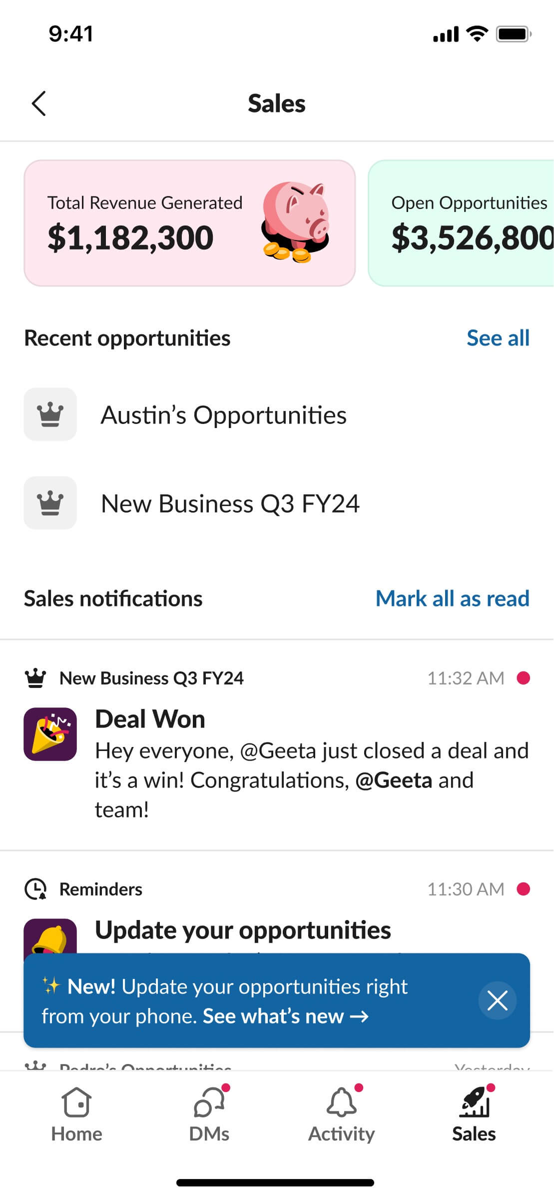
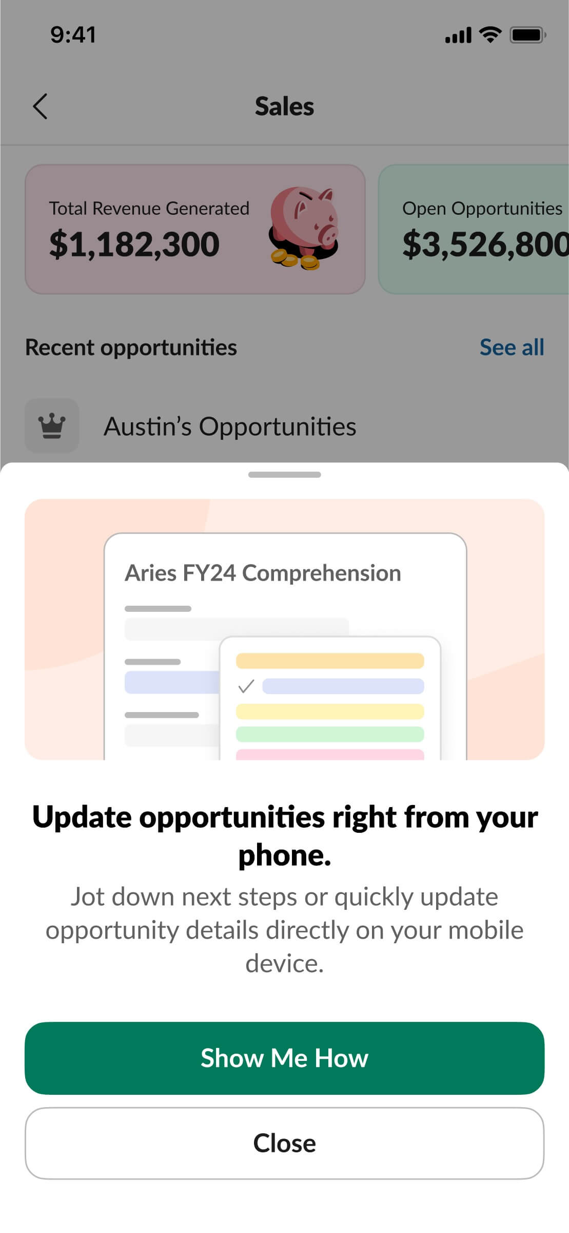
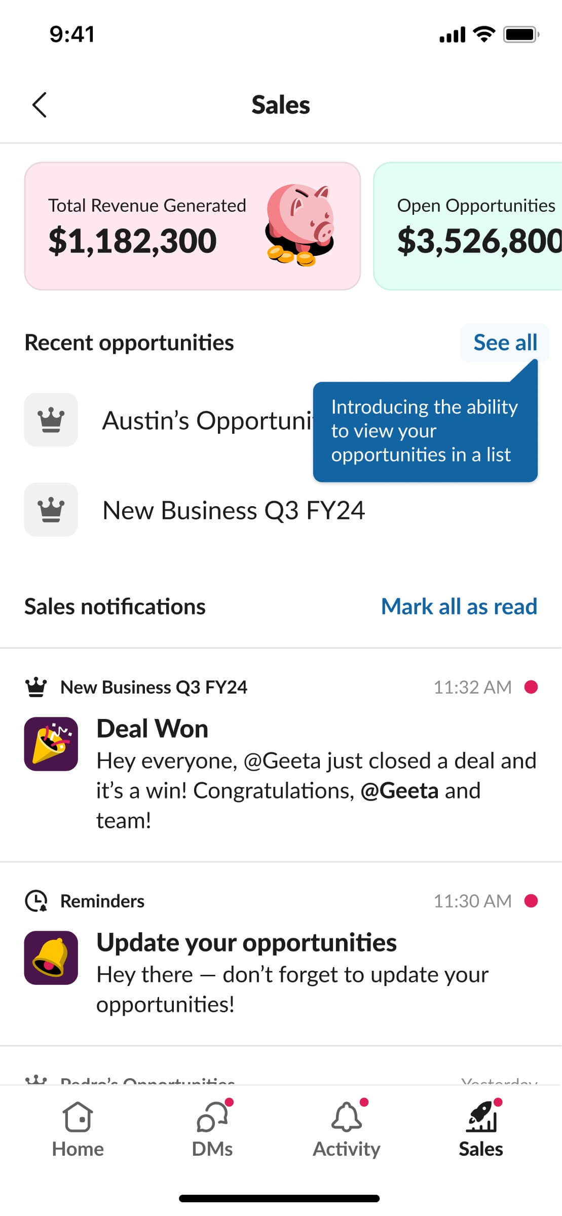
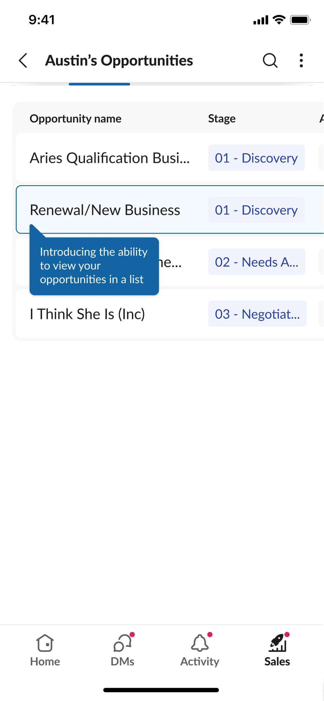
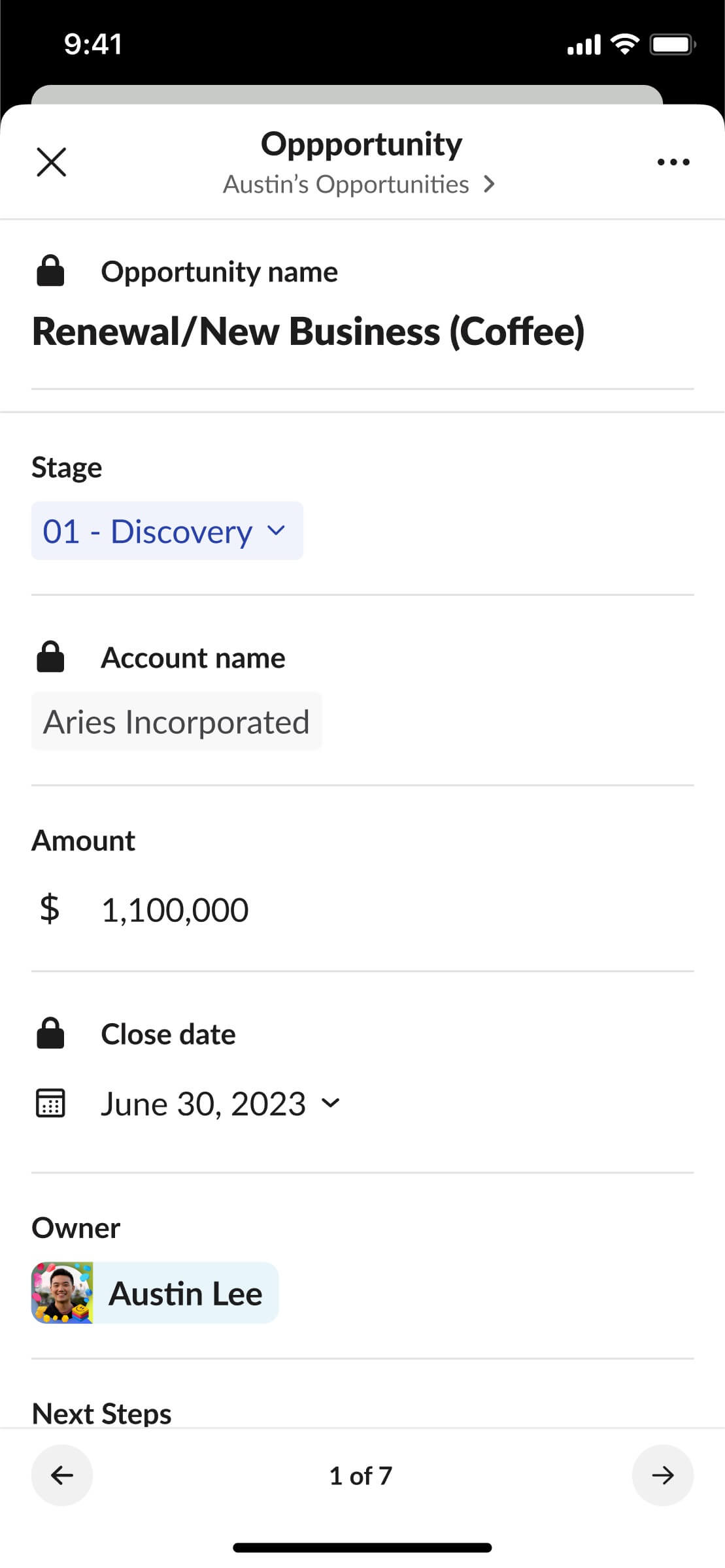
New user experience for updating opportunities in Slack Sales mobile
Week 11
Slack Demo Video
Another project I worked on with Justin was a demo video for Slack. We needed to migrate all the screens from our old Slack design to Slack's redesigned information architecture, IA4. The required turnaround time was fairly short because this video was set to be presented at Dreamforce 2023. Here’s an example of one of the screens I updated:
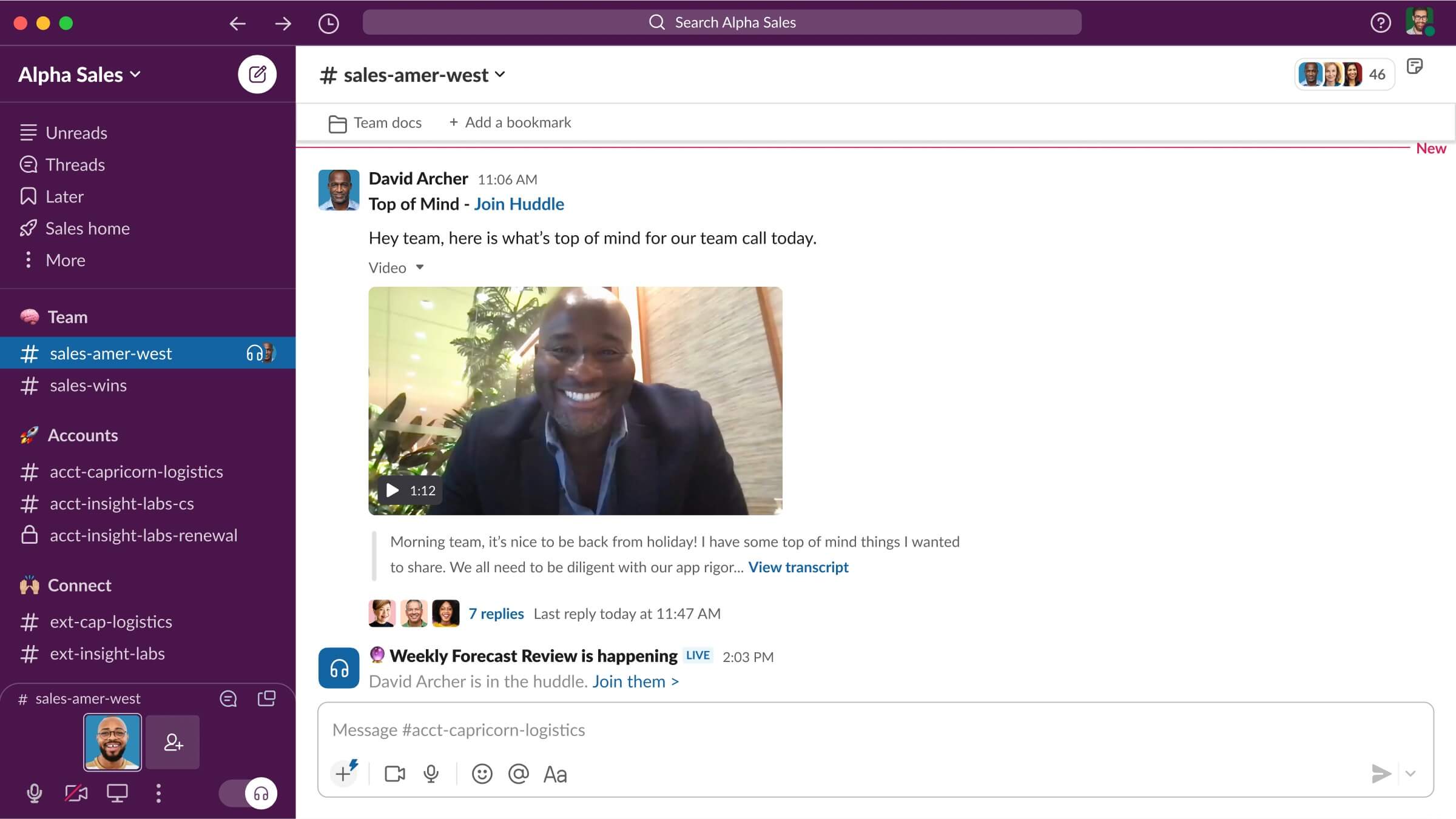
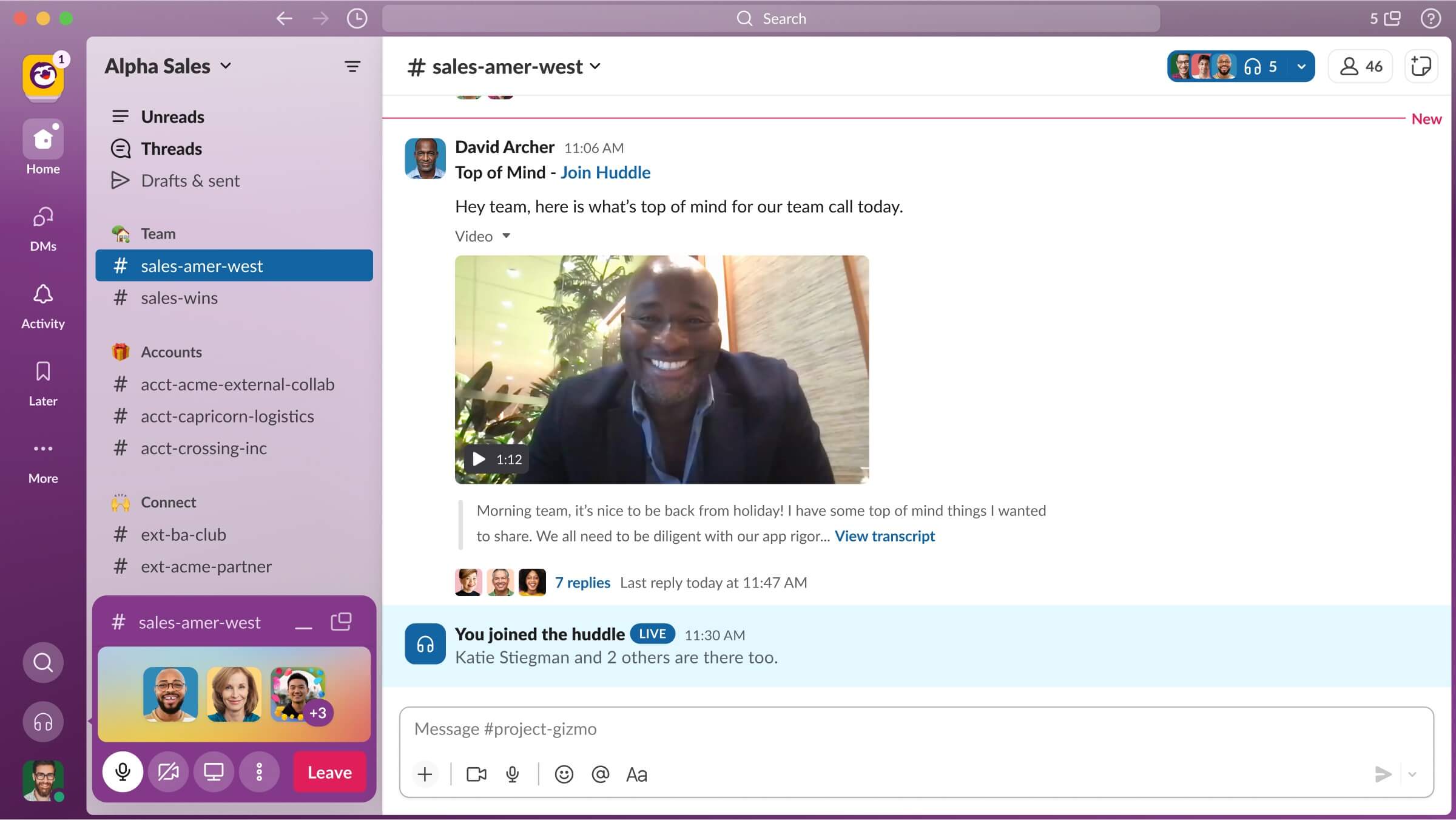
Slack’s old IA3 (left) vs Slack’s new IA4 (right)
This seemingly simple task quickly became quite challenging. Since so much of Slack changed with IA4, I needed to track down so many different Figma files and designers. Moreover, even designs within our internal Slack were undergoing updates as I was updating these screens. For example, the search bar was relocated from the left nav bar to the top just a day before the deadline. In the end, I handed all the designs over to an agency for them to animate this demo video:
New Slack product demo video
After my internship ended, Justin reached out to share that this video is now the primary Slack demo video on Salesforce.com!
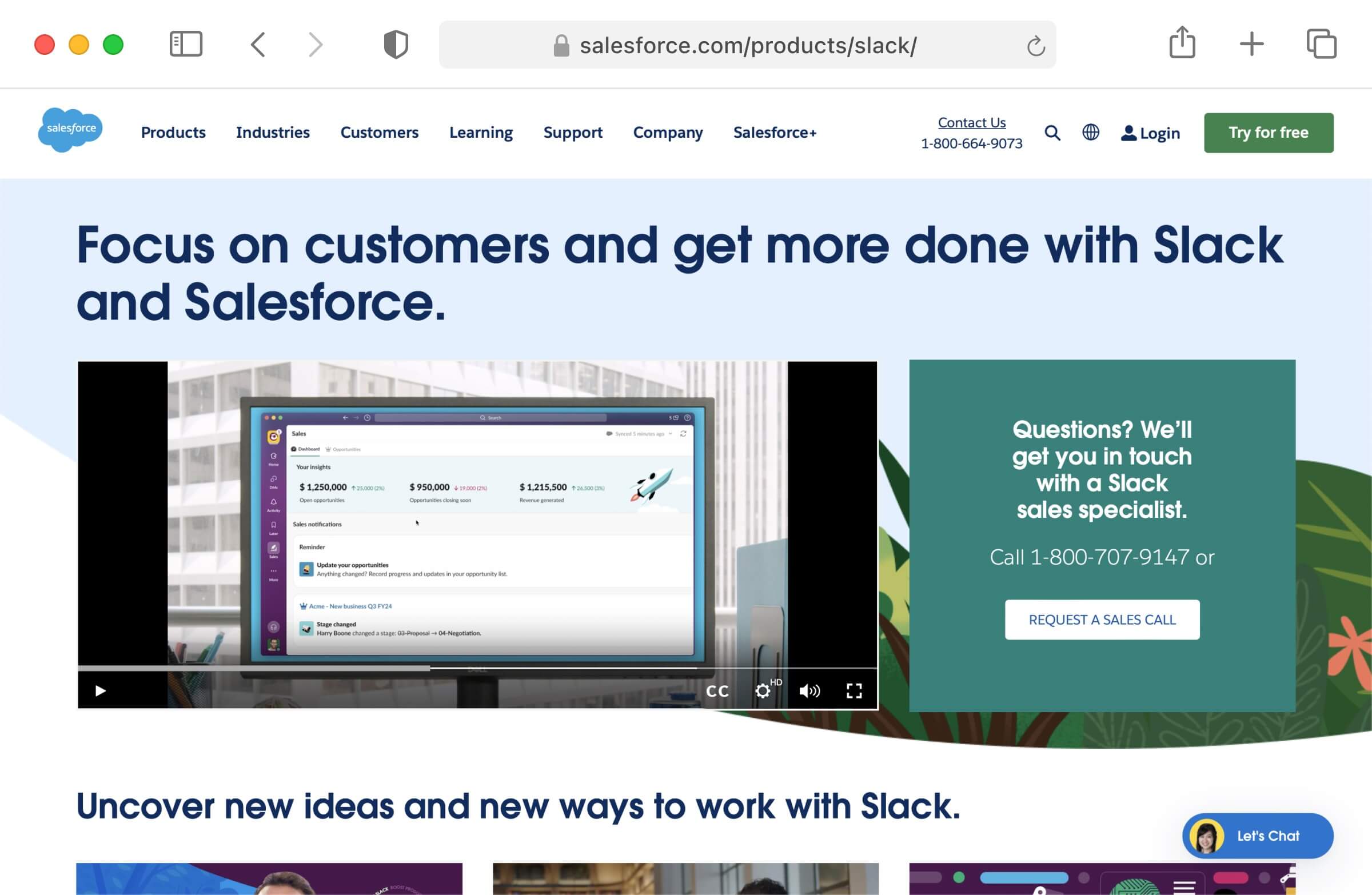
Screenshot of primary Slack demo on Salesforce website [salesforce.com/products/slack]
Week 12
Slack Kit, Audio Clips
My final project for the internship was back on design systems with Matt. This was an area I continued to want to continue learning about. This time, I chose to build a component from scratch.
Within file entities, there are audio clips which are voice recordings native to Slack. My task was to build these components for desktop, iOS, and Android. With Slack Kit, our goal is to create reusable components that are general-purpose, rather than being tied to a specific feature within Slack. Consequently, it's essential for us to name these component formats in a manner that is generic and not centered around a particular use case. However, as I started designing these in Figma, I encountered several inconsistencies. A significant inconsistency I discovered was that there were different audio players being used in production for conversation messages, Slack Canvas, and the file search feature:
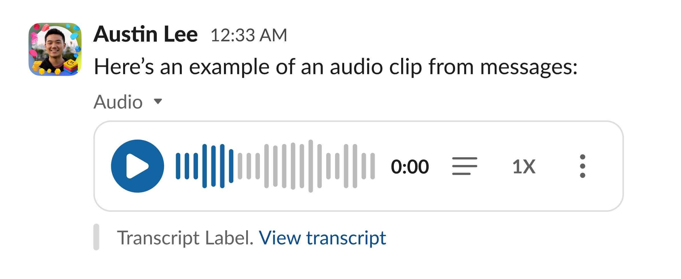
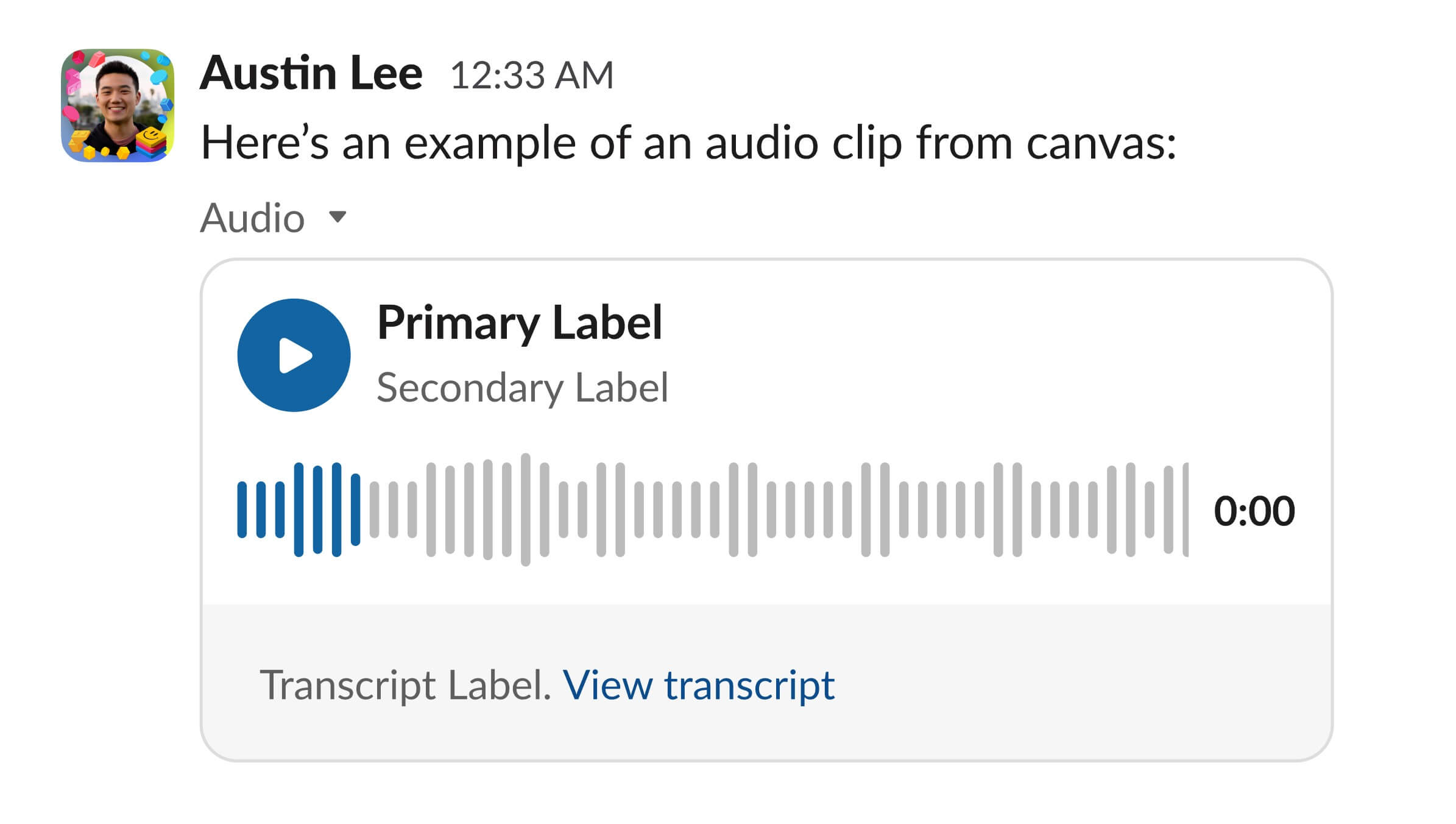
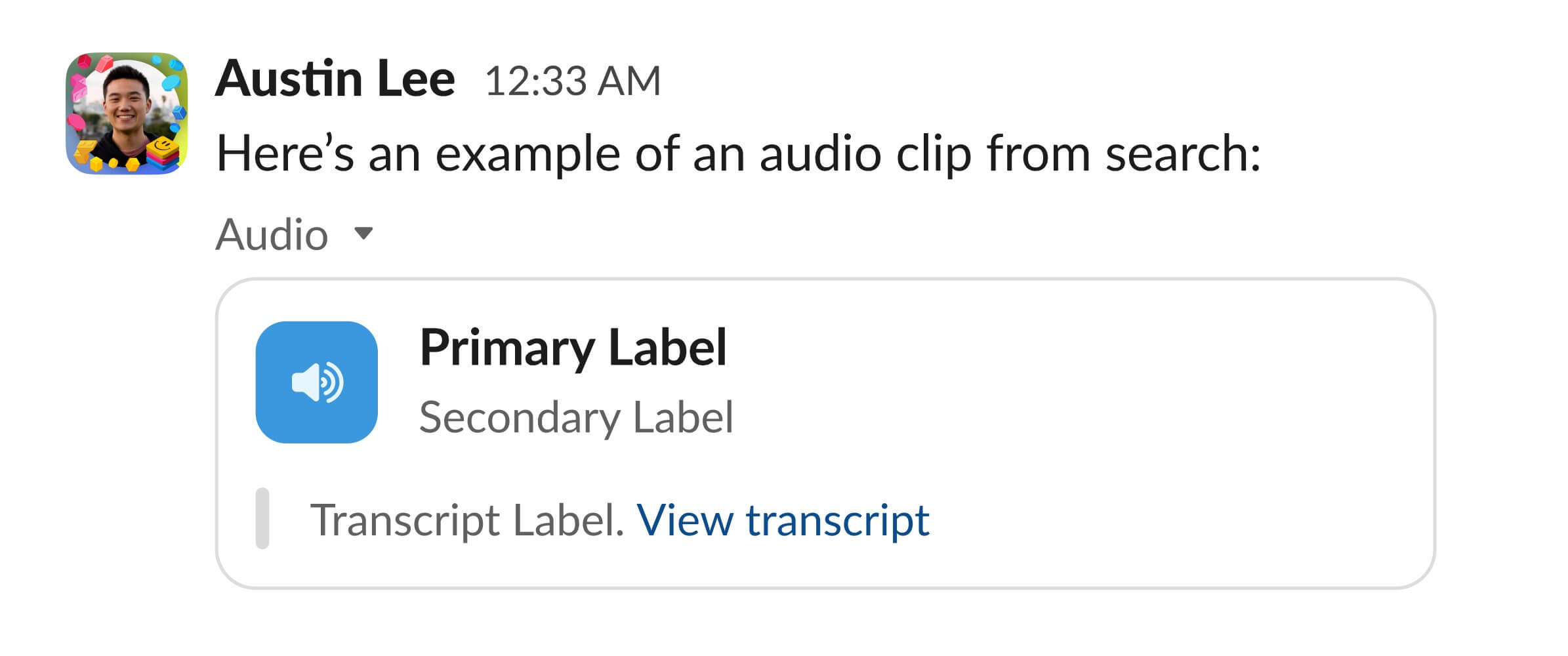
Slack audio clip design inconsistency in conversation message, canvas, and file search
The design of the conversation message works well for that specific use case, but it faces challenges when applied to canvas or file search scenarios. Its detached nature becomes particularly confusing in file search. Meanwhile, the canvas design is effective for all three scenarios, but the additional gray padding makes the player occupy more vertical space. Lastly, the file search design embeds the transcript within the player. Given that transcripts are essential to an audio file format—and one can read much faster than listen—I thought we should emphasize their significance. This third design accomplishes that. I shared this with the various teams responsible for the three use-cases, and they also agreed. As a result, the this file search design became the new component across these three use-cases.
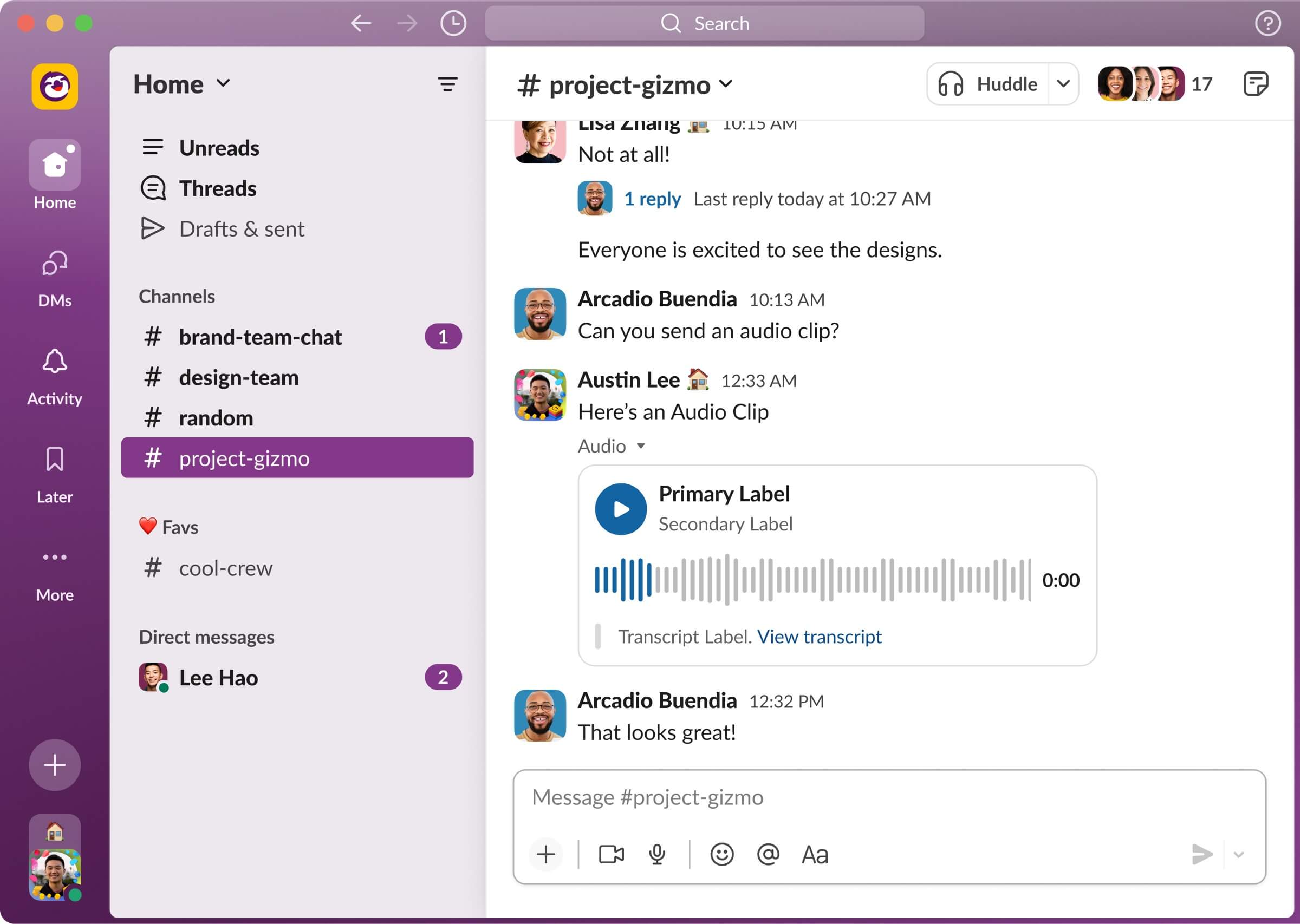
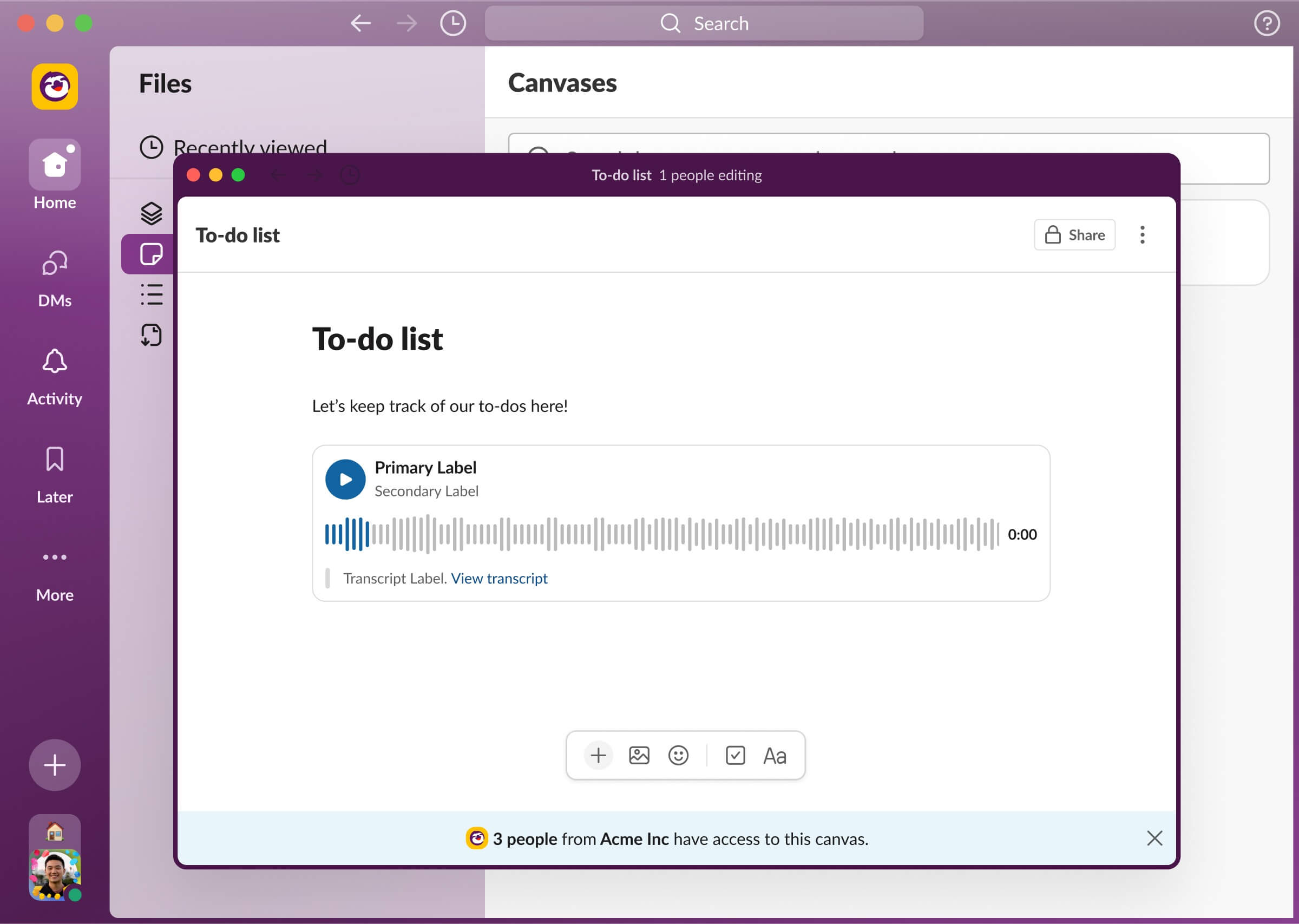

Updated Slack audio clip in conversation message, canvas, and file search
From learning Figma variables to understanding how we approach the naming and structuring of components, I gained so much from working with Matt. In retrospect, this might have been the most challenging project of the summer, but it's also where I learned the most. Ultimately, I built the following three component sets:
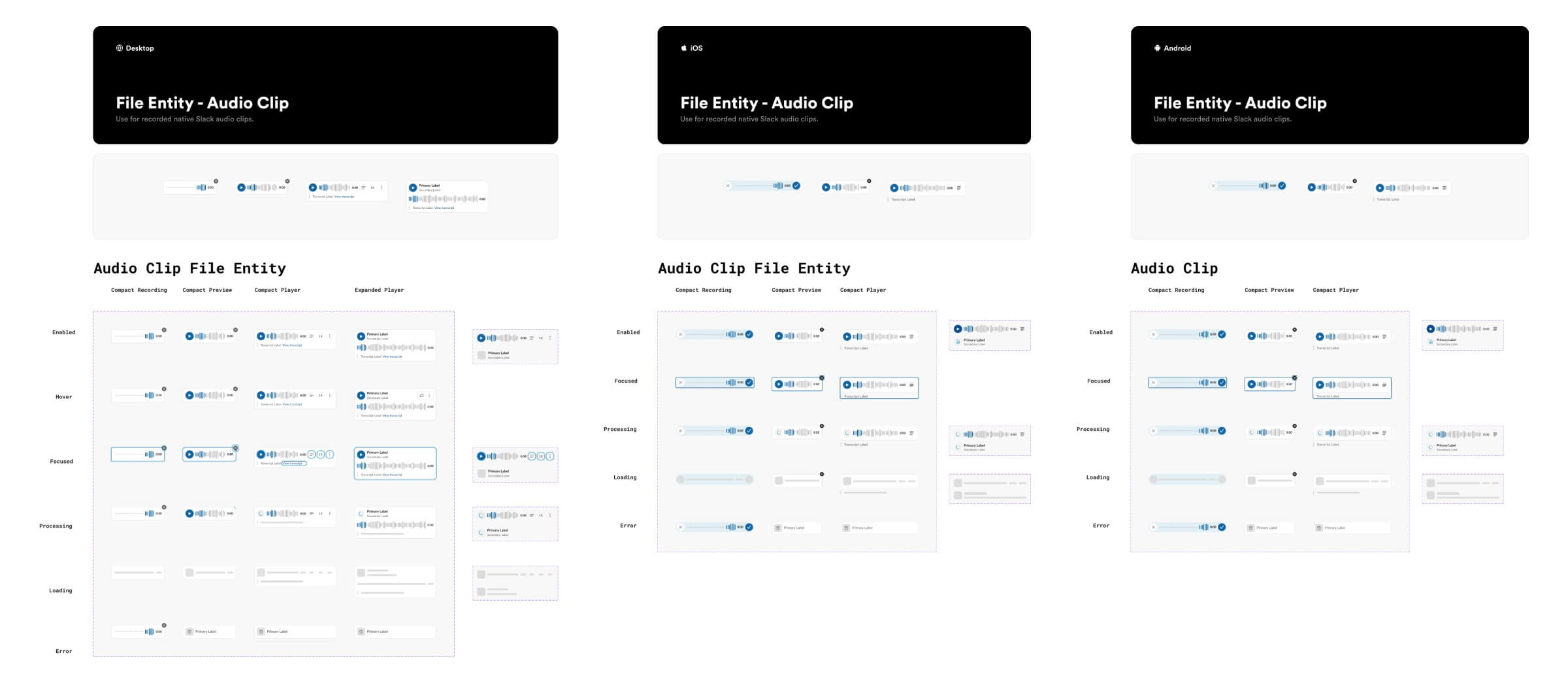
Slack audio clip components across desktop, iOS, and Android
LESSONS LEARNED
First time working with other designers.
Slack was my first experience working in a big company and it was always so interesting to see what other designers were working on. Over the course of 12 weeks, I learned so much from collaborating with these other designers and being a part of a big design team! Here are my biggest takeaways:
1. Be proactive. I've noticed that Slack's culture deeply values and rewards go-getters who actively seek solutions instead of waiting for help. This became evident to me while waiting for Matt's feedback on my desktop components. He emphasized the significance of taking initiative, suggesting I start building the mobile components to keep from being bottlenecked by his review. Throughout the summer, I was also always encouraged to reach out and message individuals throughout the company, whether it’d be to ask for help on a project or just to chat and learn about their career.
2. Take inspiration from existing patterns in the world. This was something Pratik, my intern mentor, always emphasized. Each time he critiqued my designs, he'd prompt me to recall where I might have encountered similar patterns previously. When designing the Workflow permissions page, we drew parallels to permission management in platforms like Google Docs and Figma. Similarly, when redesigning the mobile “WORKFLOW” pill, Pratik pointed out social media apps had similar patterns, guiding our exploration in that direction.
3. Being an exceptional designer also means being an exceptional communicator. Several of the projects I worked on involved many individuals across disciplines. This required me to not only present my designs, but also the problem we’re solving and the rationale behind these design decisions. Similarly, there were several meetings where all the designers at Slack presented our work to the rest of the team. Effective communication was crucial in these meetings to ensure that other designers, who might not have any context about our team or project, could still understand our designs. On top of that, what resonated deeply with me was my team's perspective that as you ascend in design seniority, exceptional visual design becomes an expectation, but being a great communicator is what makes you stand out.



The photo in the middle is with the two other design interns and Ethan (SVP Design). Other photos are with my intern friends at the office.
Thanks for reading :)
